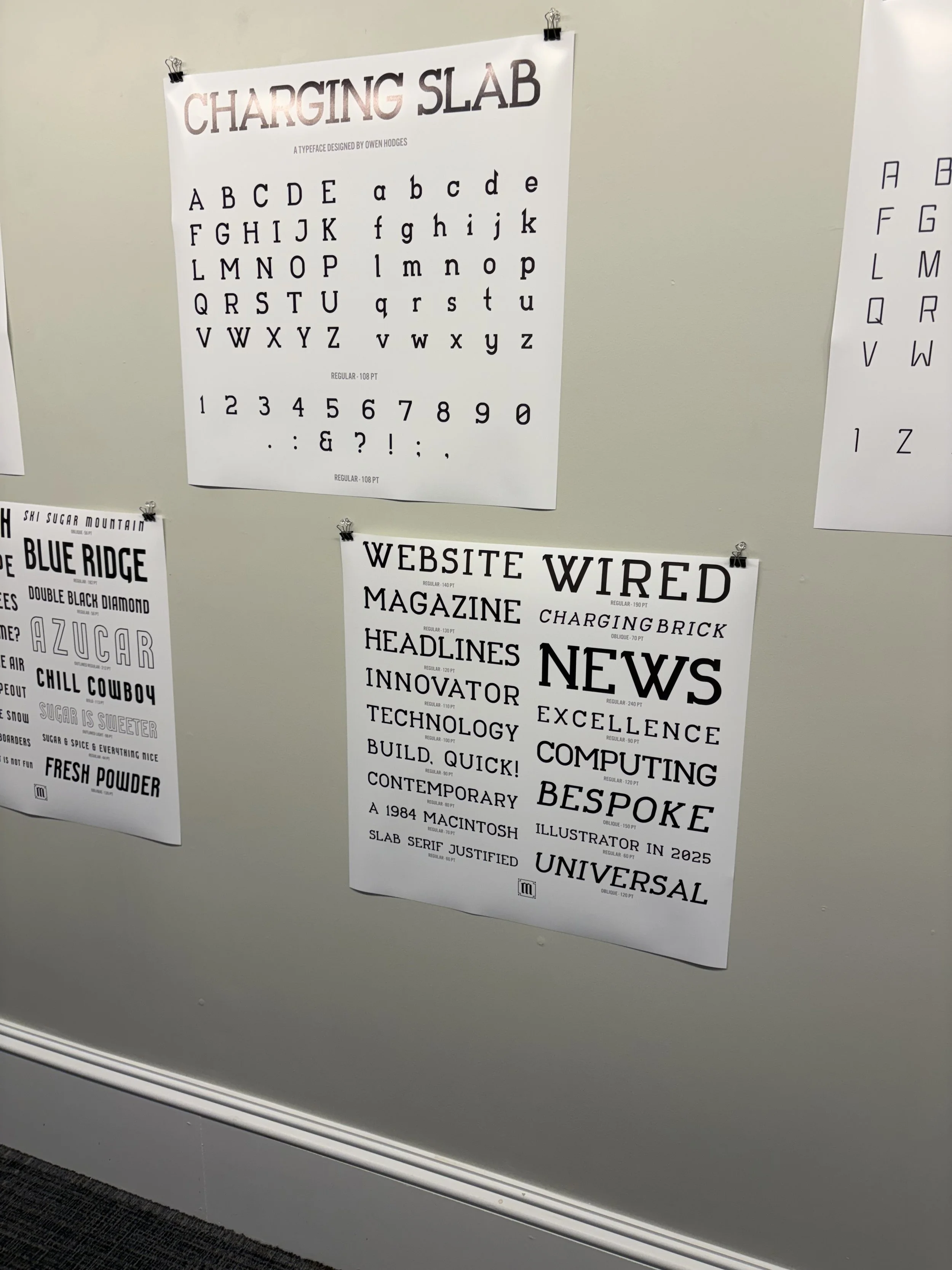
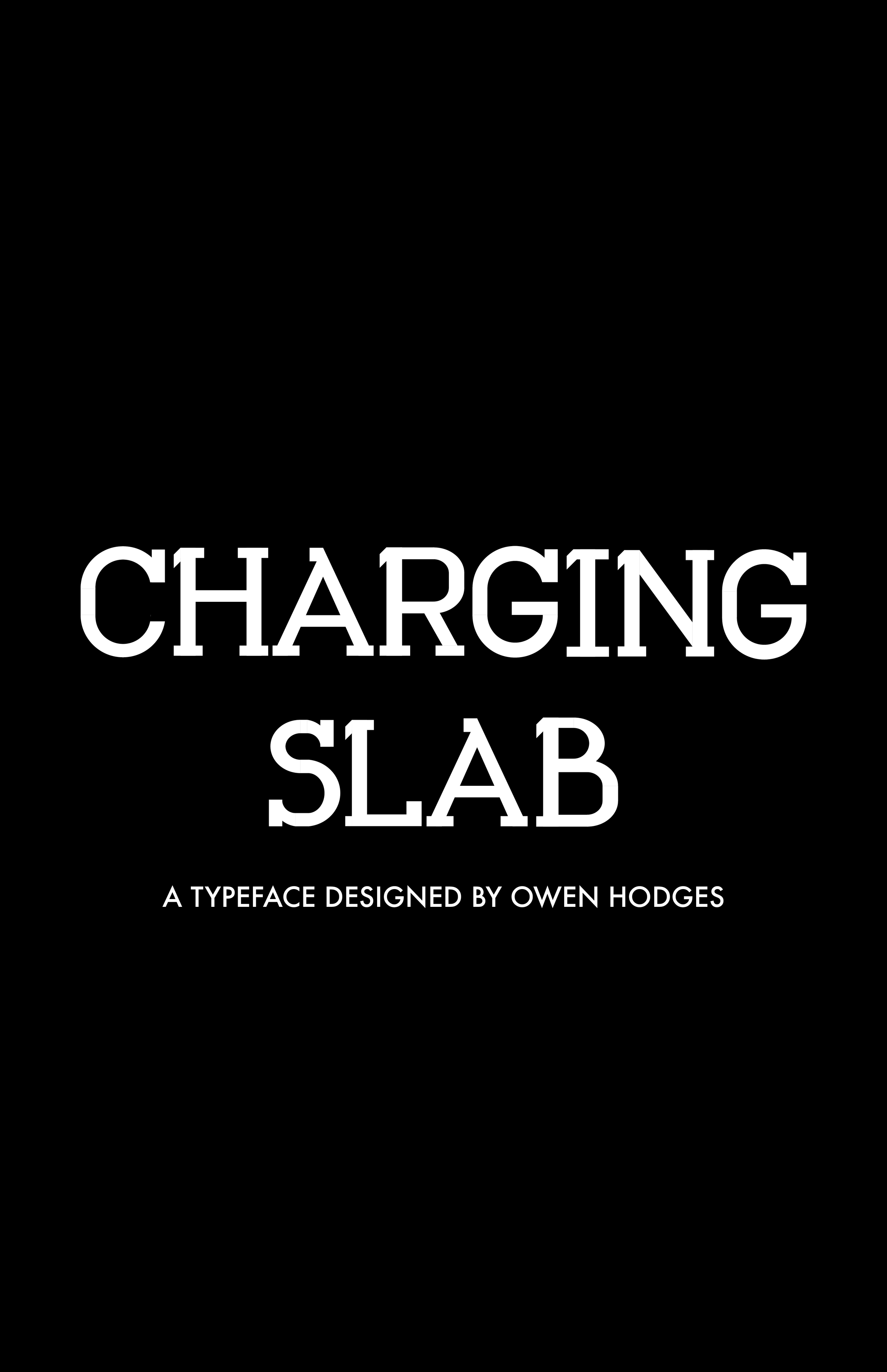
Posters on a wall featuring different fonts and typefaces, including a 'Charging Slab' font chart designed by Owen Hodges.

Charging Slab

Project Title: Charging Slab

Components: Bespoke Typeface, Printed Case Study

Software Used: Adobe Illustrator, Adobe InDesign, FontSelf

Typefaces Used: Charging Slab (bespoke), Futura

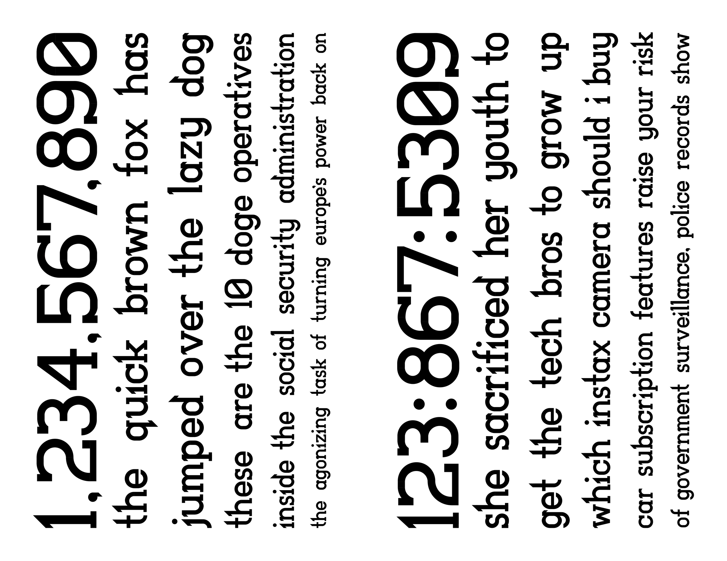
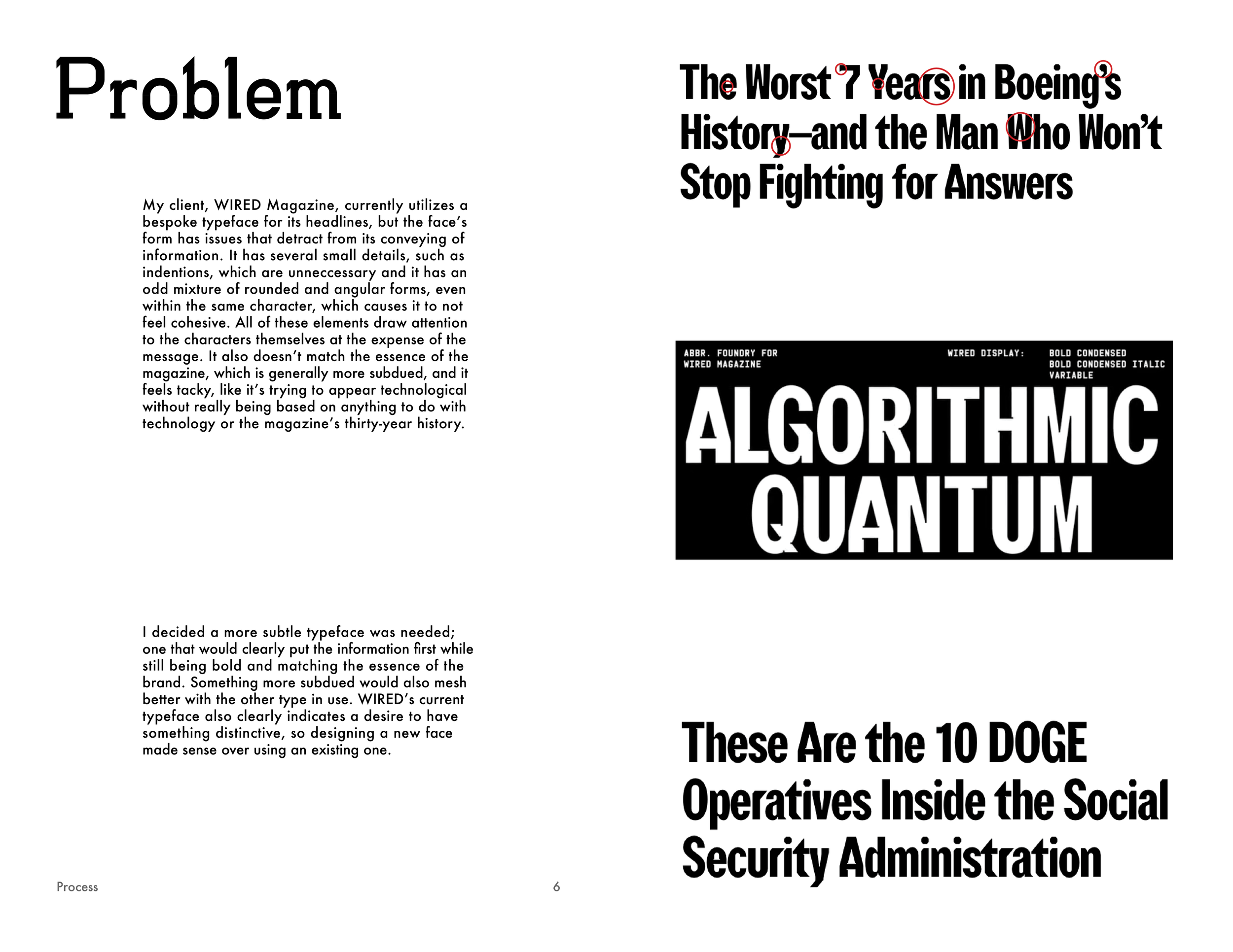
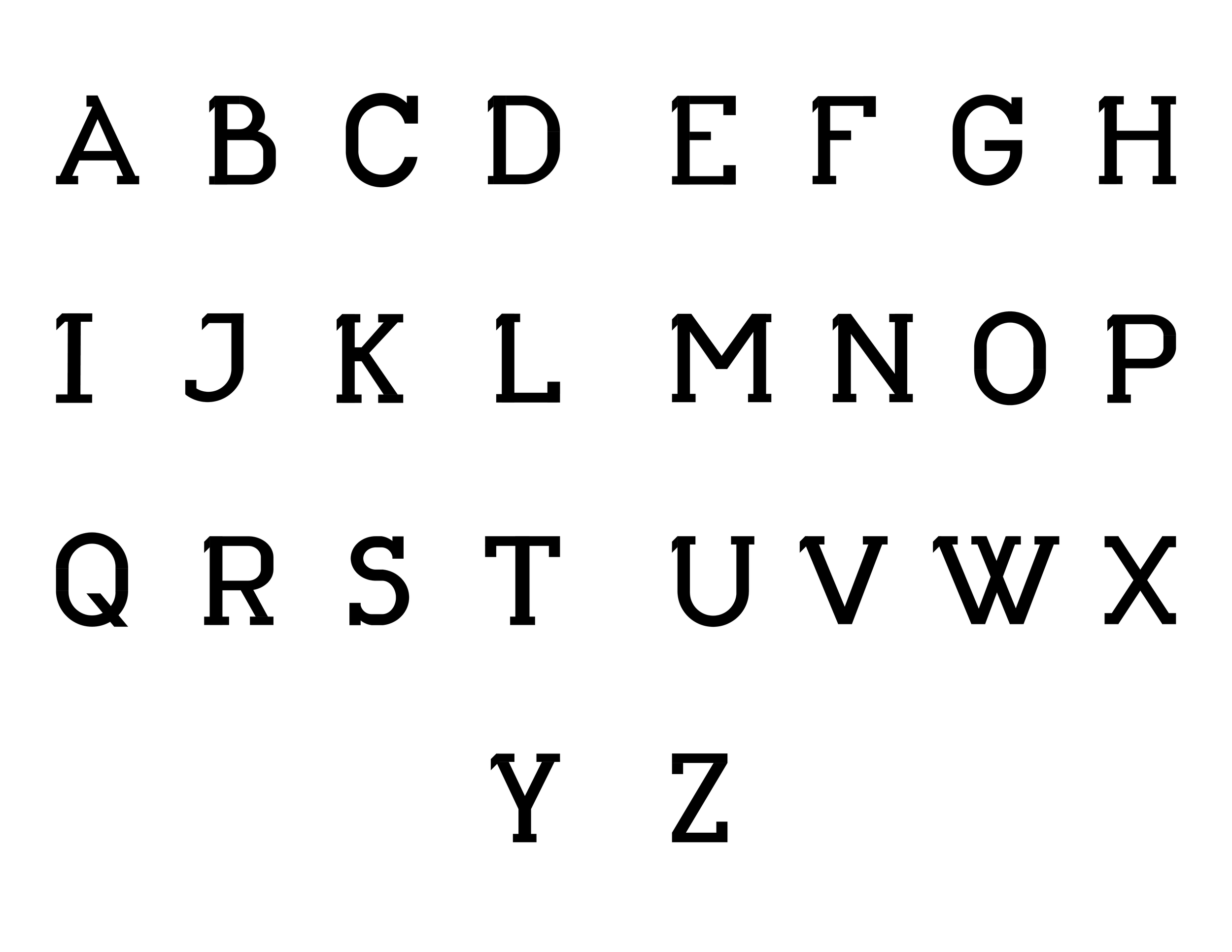
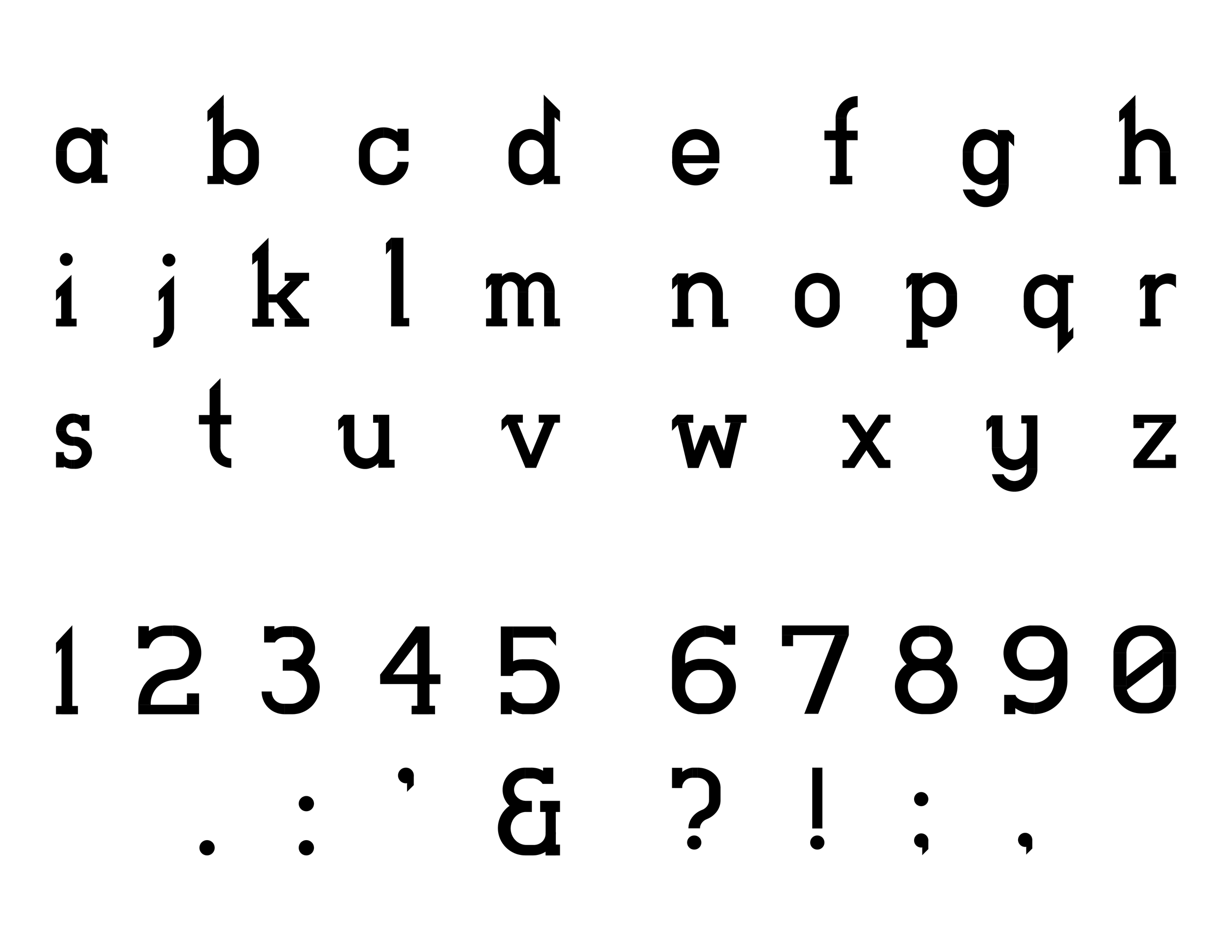
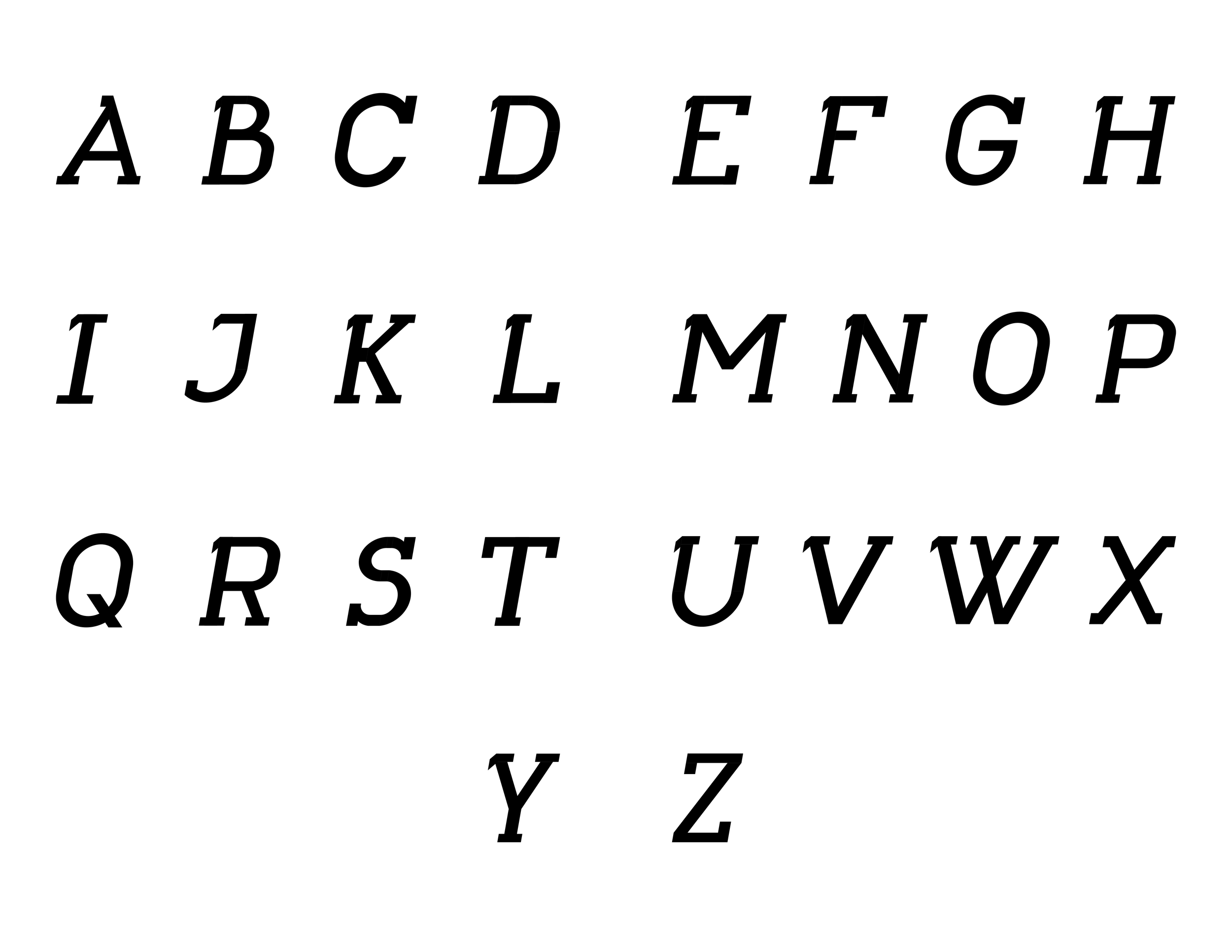
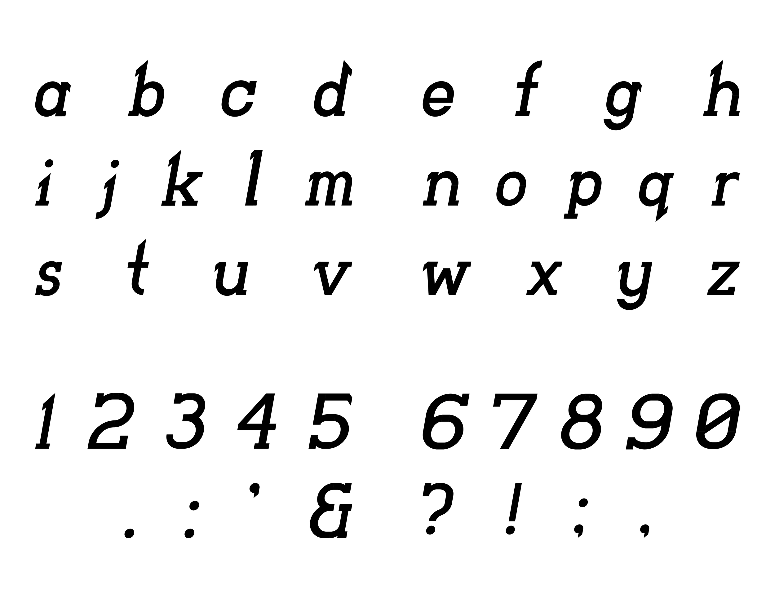
Charging Slab is a slab-serif display typeface that I designed for WIRED Magazine to use for their online headlines. It’s designed to replace their current typeface, WIRED Display, which has an inconsistent and needlessly confusing mixture of angular and curved forms that distracts from the content of the headline.

Charging Slab intends to capture the same solid, industrial feeling that the current face does, but in a more subtle and elegant way. It has a consistently bold weight designed to draw the attention of readers, and its slab-serif nature lets it preserve the blocky look of the original face while not going to the point of being tacky.

Book cover titled 'Charging Slab,' designed by Owen Hodges, with a black background and large white text.
Table of contents page with black background on the left and white background on the right. The left side shows large white text reading 'TABLE OF CONTENTS'. The right side lists sections and pages: Process, Problem, Research, Sketching, Evolution, Specimen, Regular, Oblique, Range of Use, In Context, All Minuscule, All Majuscule, Colophon.
Dark separation spread, and white text reading "PROCESS" alongside the words "Problem, Research, Sketching, Evolution".
A publication page with text discussing issues with font choices and design in a magazine, highlighting problems with the existing typeface used by WIRED.
A digital drawing of a hedgehog, with spiky fur and a black nose, speaking in a speech bubble. The background is light green, and the text in the speech bubble reads, 'This is the old typeface he was going on about earlier.'
A magazine page titled 'Research' with a paragraph explaining the influence of digital typefaces and the designer's choice of a geometric, monoline face inspired by early digital fonts, and a handwritten note about the 'WIRED' typeface, including historical context, characteristics, and research notes, with a black-and-white 'WIRED' letterhead at the bottom.
Page from a design process book showing sketches of letterforms and a text description of the designer's process in developing a sans serif and slab serif typeface.

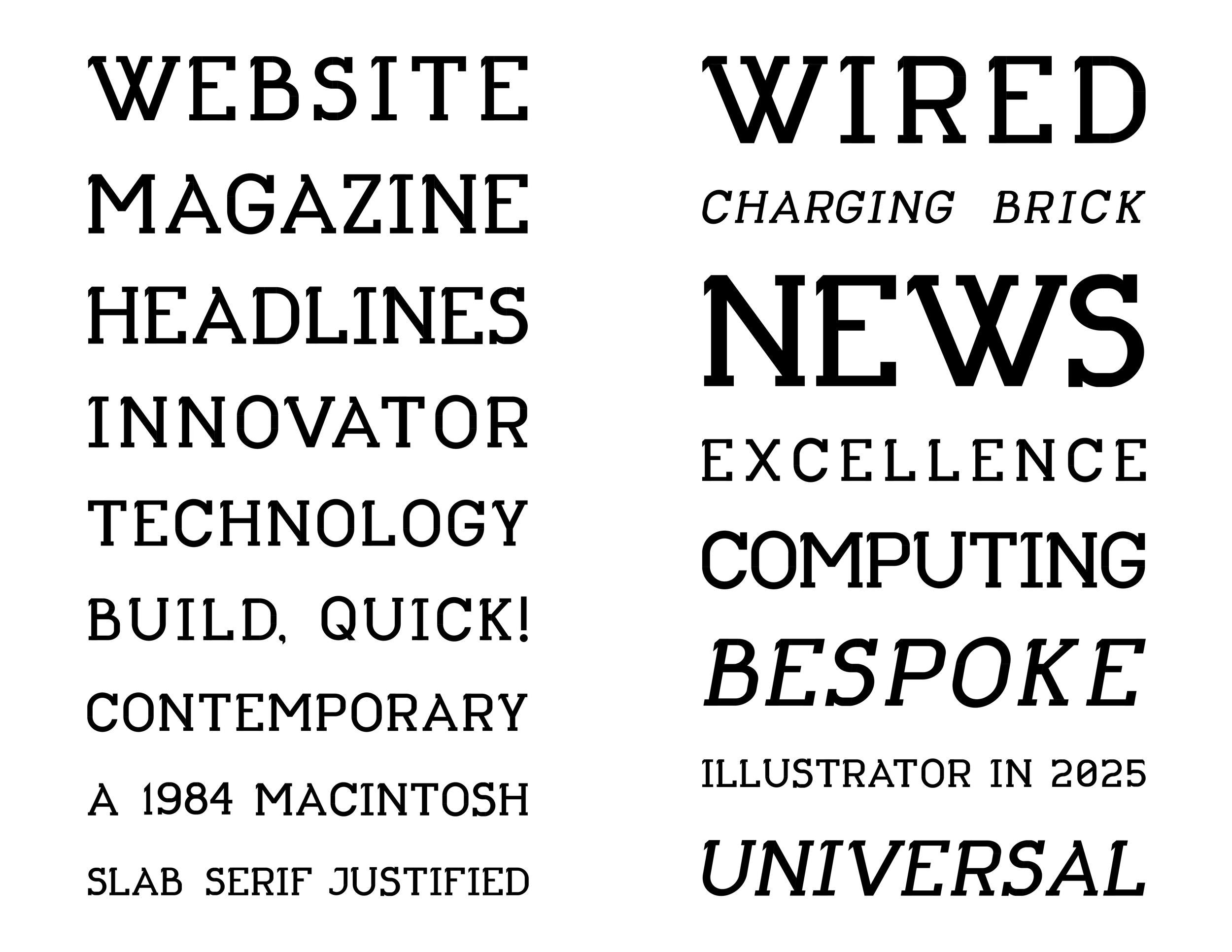
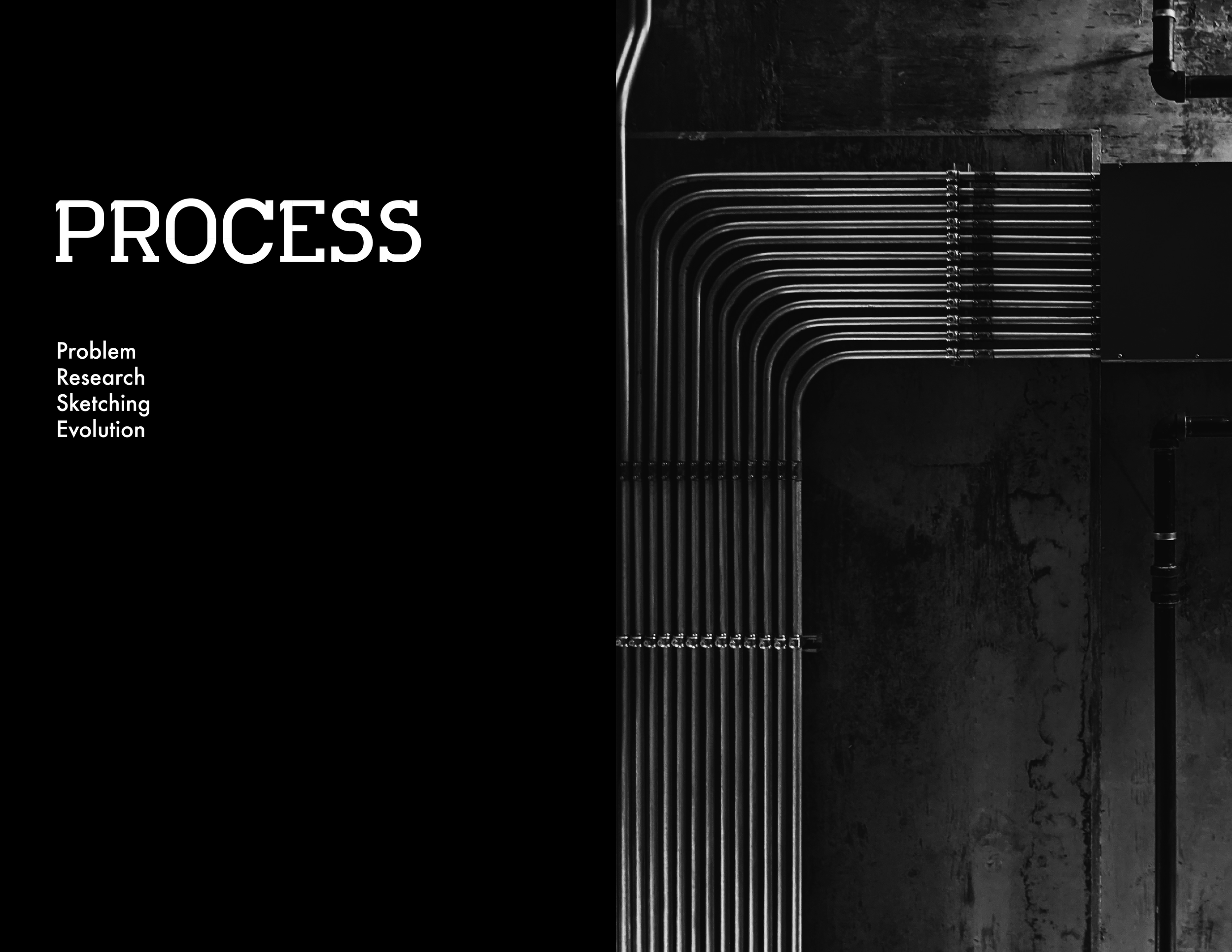
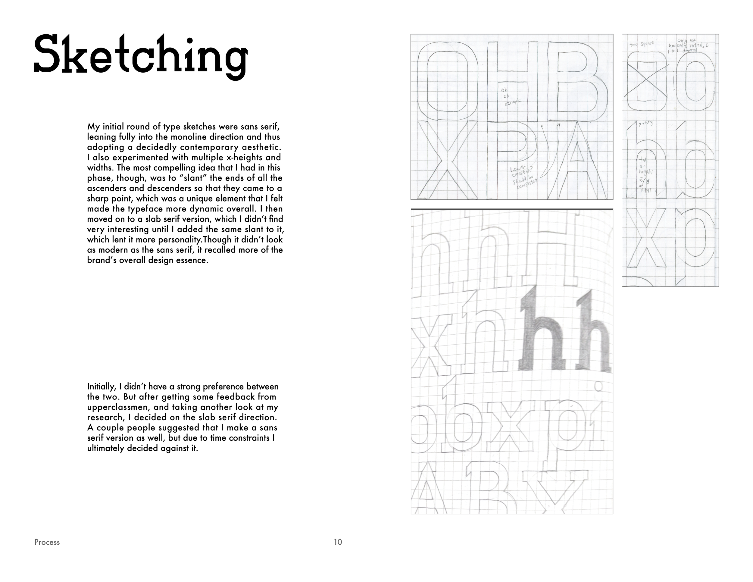
Initially, I considered a sans-serif typeface, but decided it looked too plain to accomplish its aim of standing out and commanding focus.

Once I had chosen the slab serif version, I also struggled with deciding how and where to implement the slanted serif at the top left, which was a distinctive feature of the typeface that I was consistently told to expand the use of to more characters.

Two pages of a book discussing font design, showing text about the evolution of Charging Slab's distinct letterforms, with examples of the word 'Vimeo' and a 'W' in various font styles.

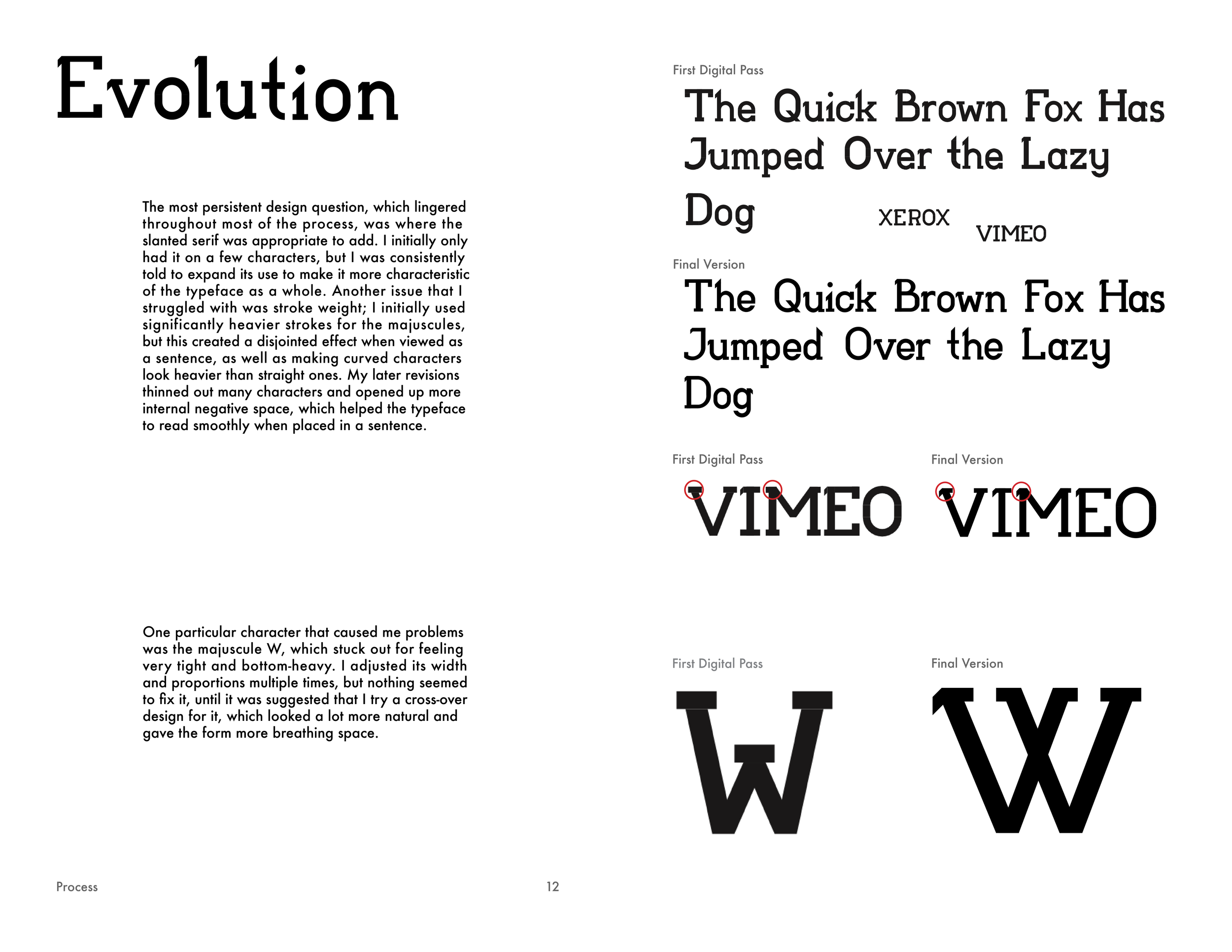
The design aspect I struggled with most was the weight of the type; my initial passes felt too heavy. There were also certain characters, such as the majuscule W, that commanded too much attention compared to the others. I spent the bulk of the iteration process getting to a weight I was happy with.

Black and white separation spread, with the word 'SPECIMEN' and text 'Regular' and 'Oblique' on the left side.
Charging Slab majuscule letters from A to Z arranged in four rows, with the first three rows having eight letters each, and the last row having two letters, on a white background.
Charging Slab minuscule alphabet and numbers in a stylized black font on a white background.
Charging Slab Oblique with majuscule letters in a stylized font against a white background.
Charging Slab Oblique minuscule alphabet and numbers in a stylized font with some symbols.
A cartoon drawing of a hedgehog with a speech bubble saying 'I haven't spoken in a while.'
Dark separation spread with the text 'Range of Use' on the left side.
Two-page spread of a WIRED webpage layout showcasing Charging Slab as it would actually be implemented.

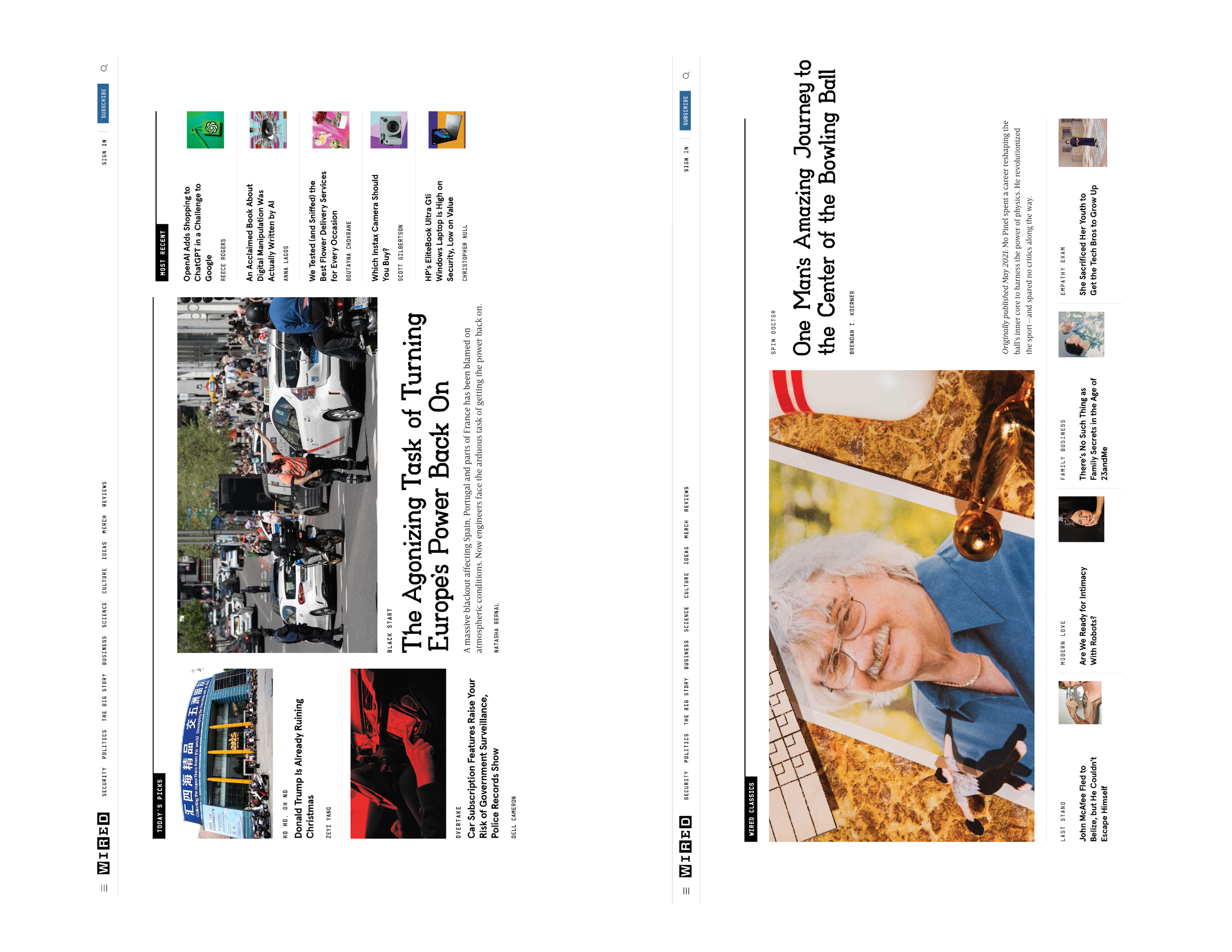
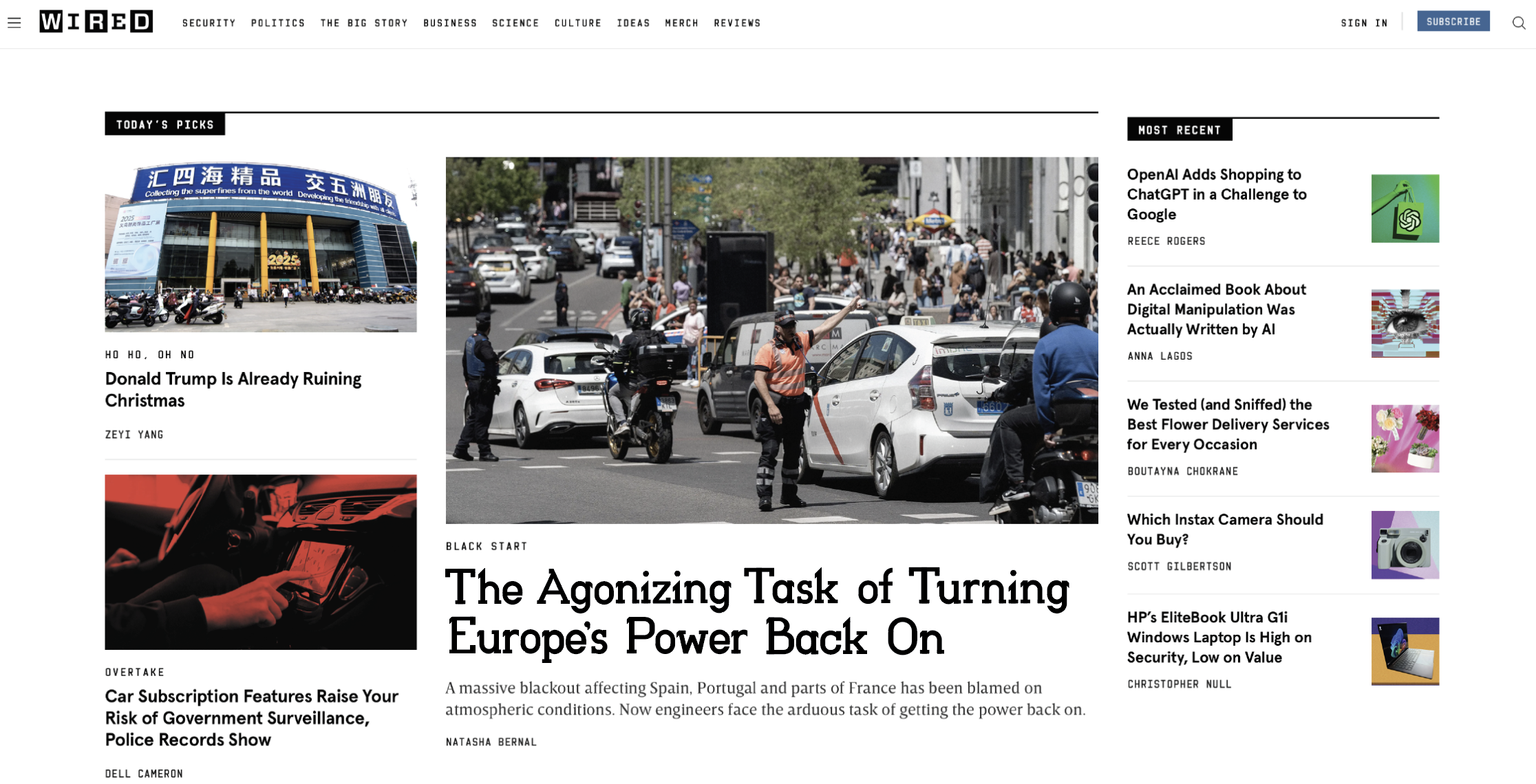
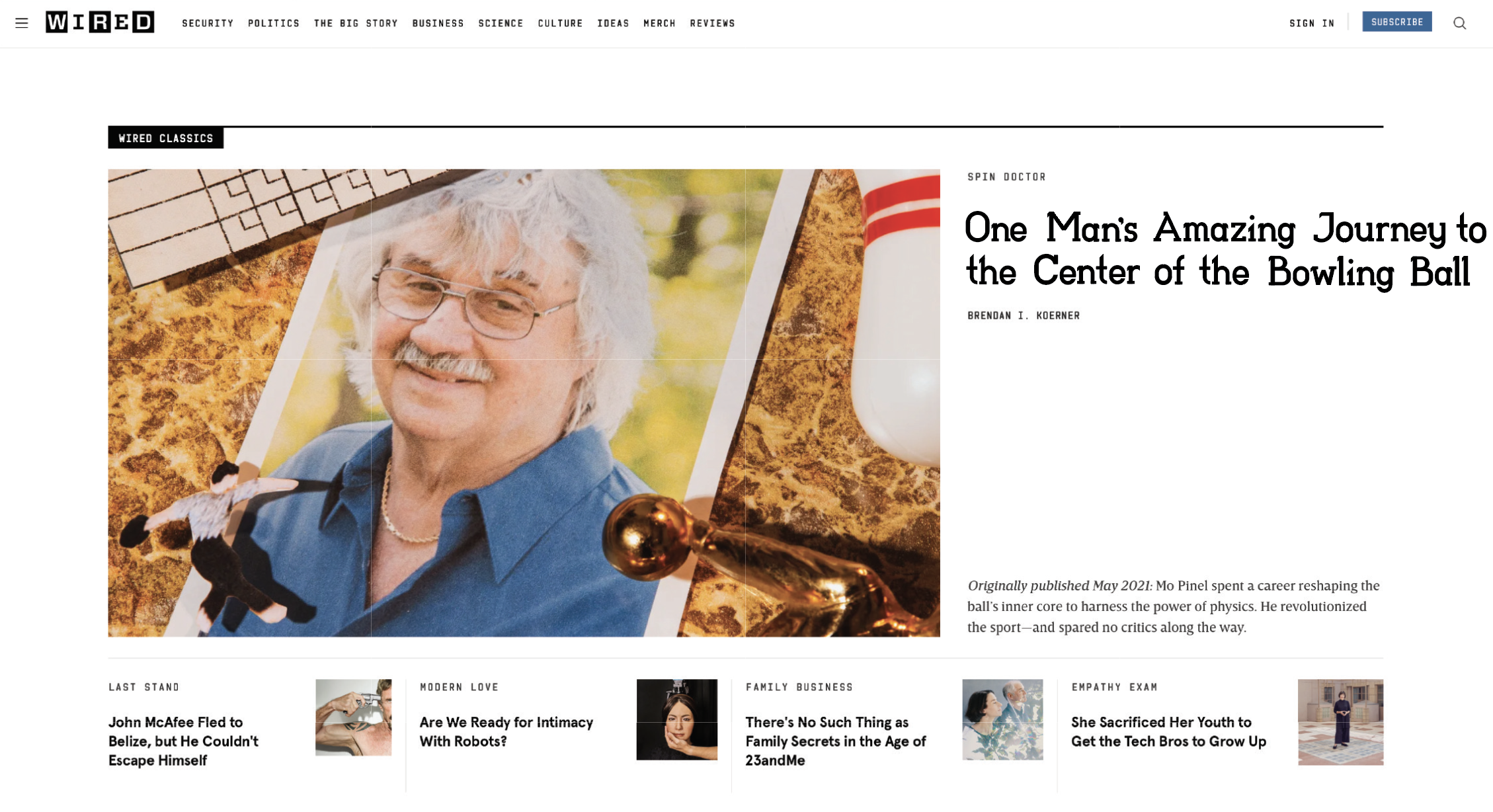
This spread shows the typeface as it would appear on WIRED’s actual home page. If I were to do this case study again, I would have dedicated a full spread to each image, rather than just one page, to show the type at a larger size.

Range of Use for Charging Slab typeface.