Issue No. 1
Project Title: Issue No. 1
Components: Photographs, Printed Case Study, Live Exhibition
Software Used: Adobe Photoshop, Adobe InDesign
Typefaces Used: Lincoln Electric, Chamfer Gothic Ludlow, ITC Avant Garde Gothic
Team: Myself, Ashton Crochet, Rhena Johnson, Kennedy Roush
My roles: Publication design, copy writing, typesetting, research
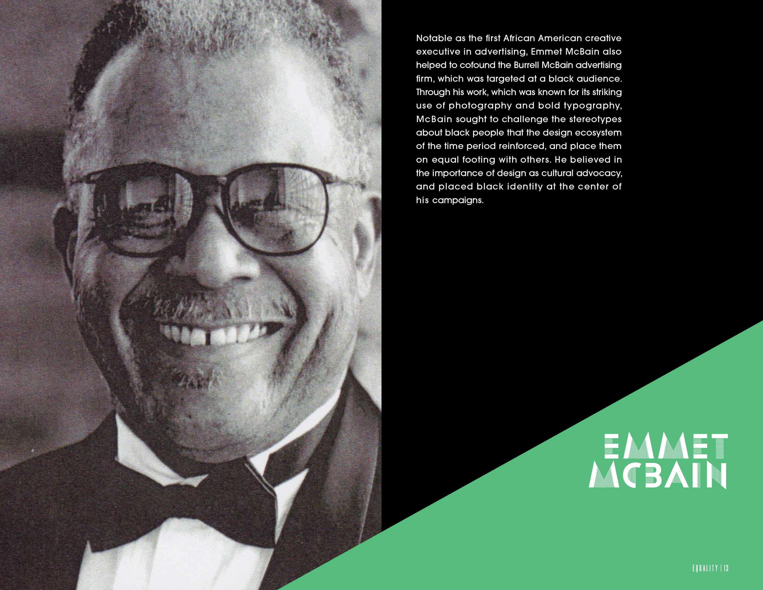
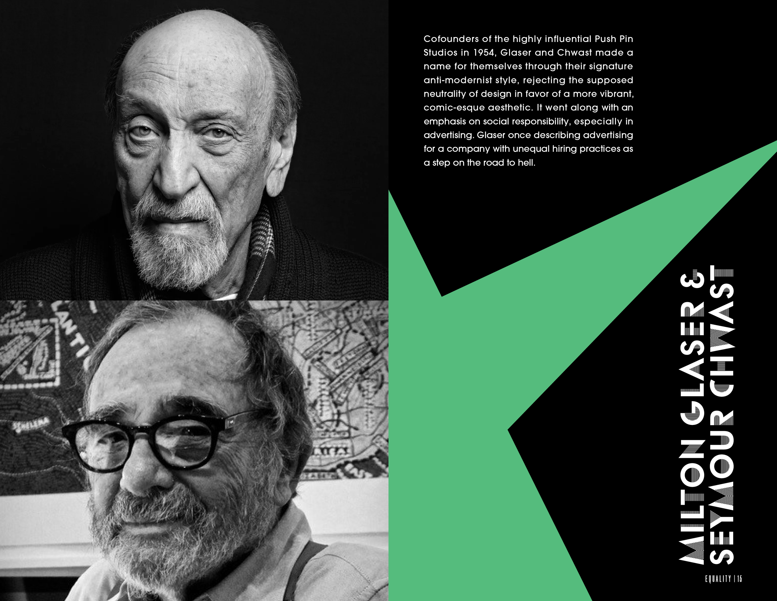
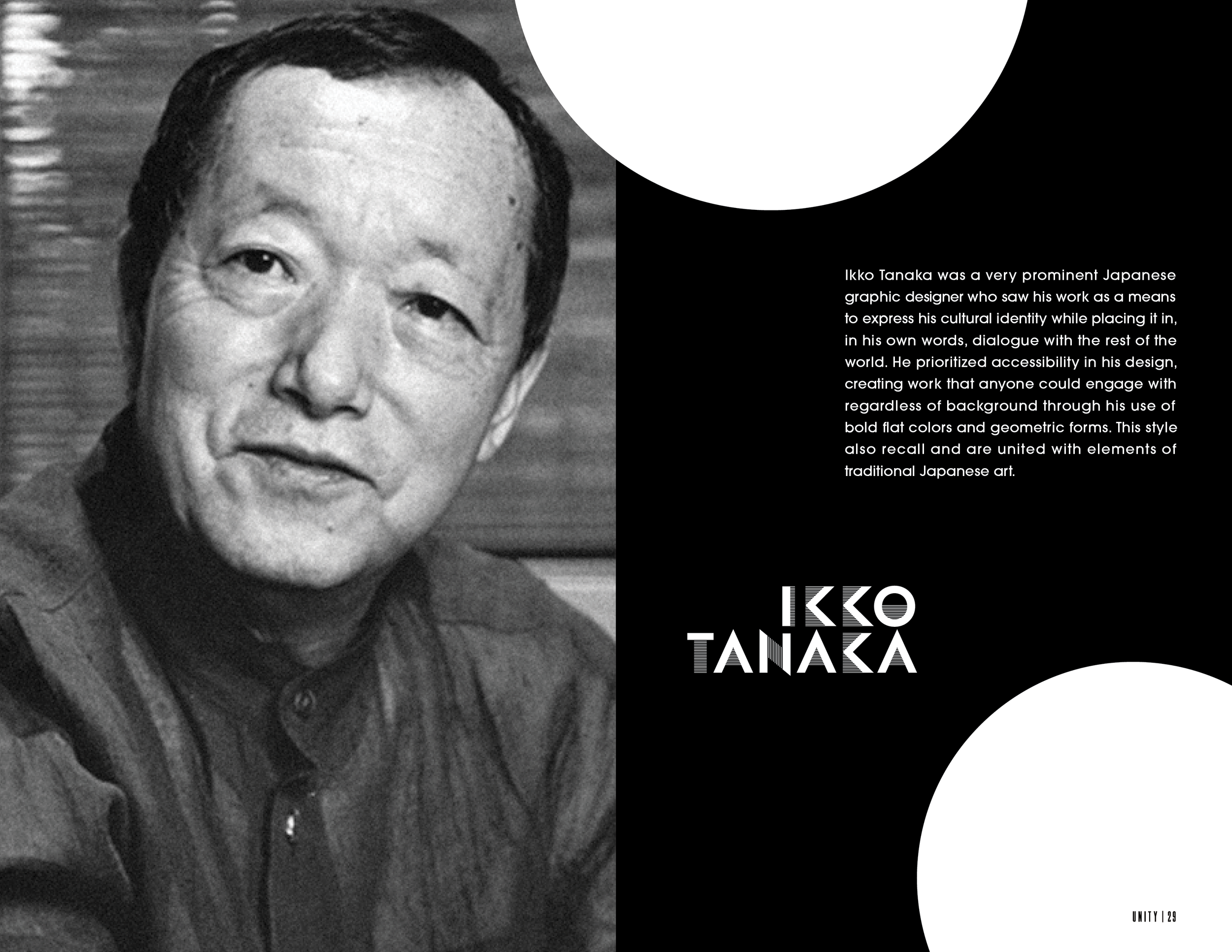
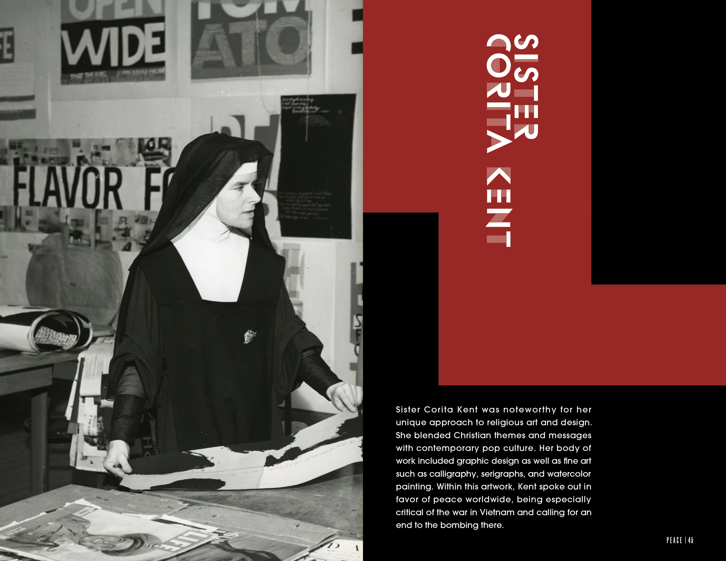
My team and I were tasked with creating a publication based on the work of a group of designers from around the 1960s. The collection had little in common visually, but most of them did seek to address a social issue in their work. The title, Issue No. 1, carries a double meaning as it’s both the first of its kind and dedicated to unaddressed social issues.
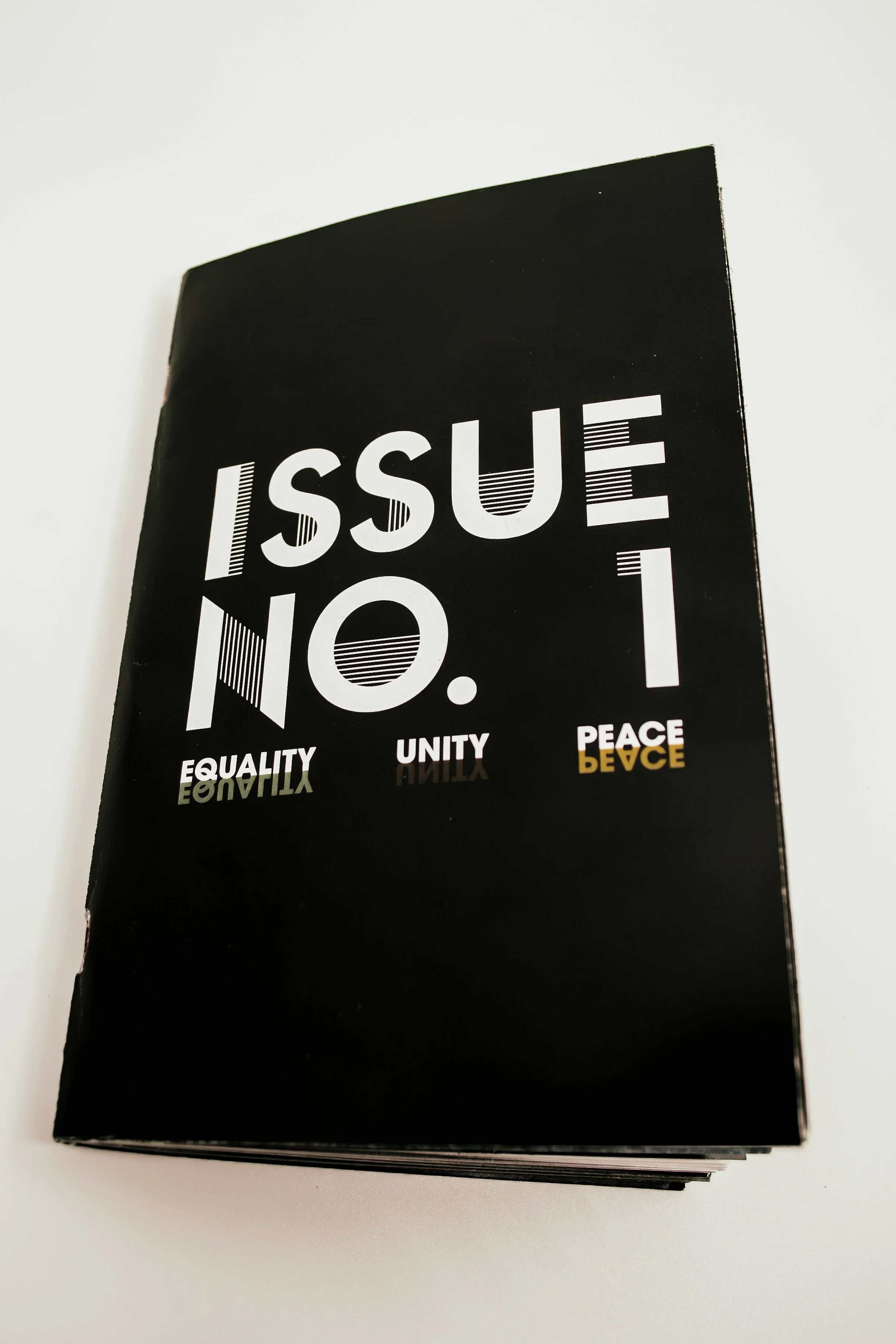
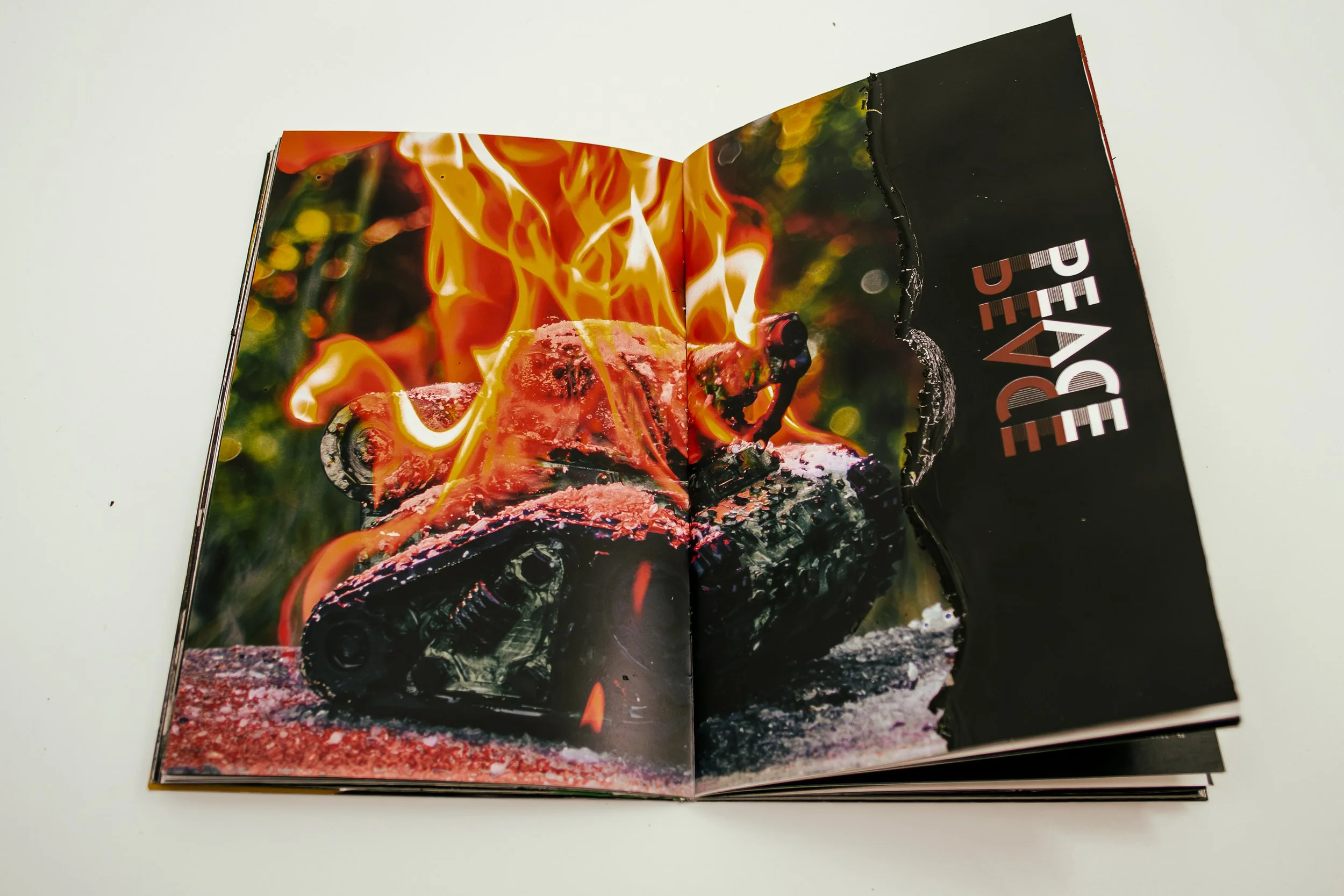
We chose to divide our publication according to what issue the designers were mostly focused on; inequality, social division, and war. We titled the sections according to the opposite of each problem, which is being strived for by our designers.
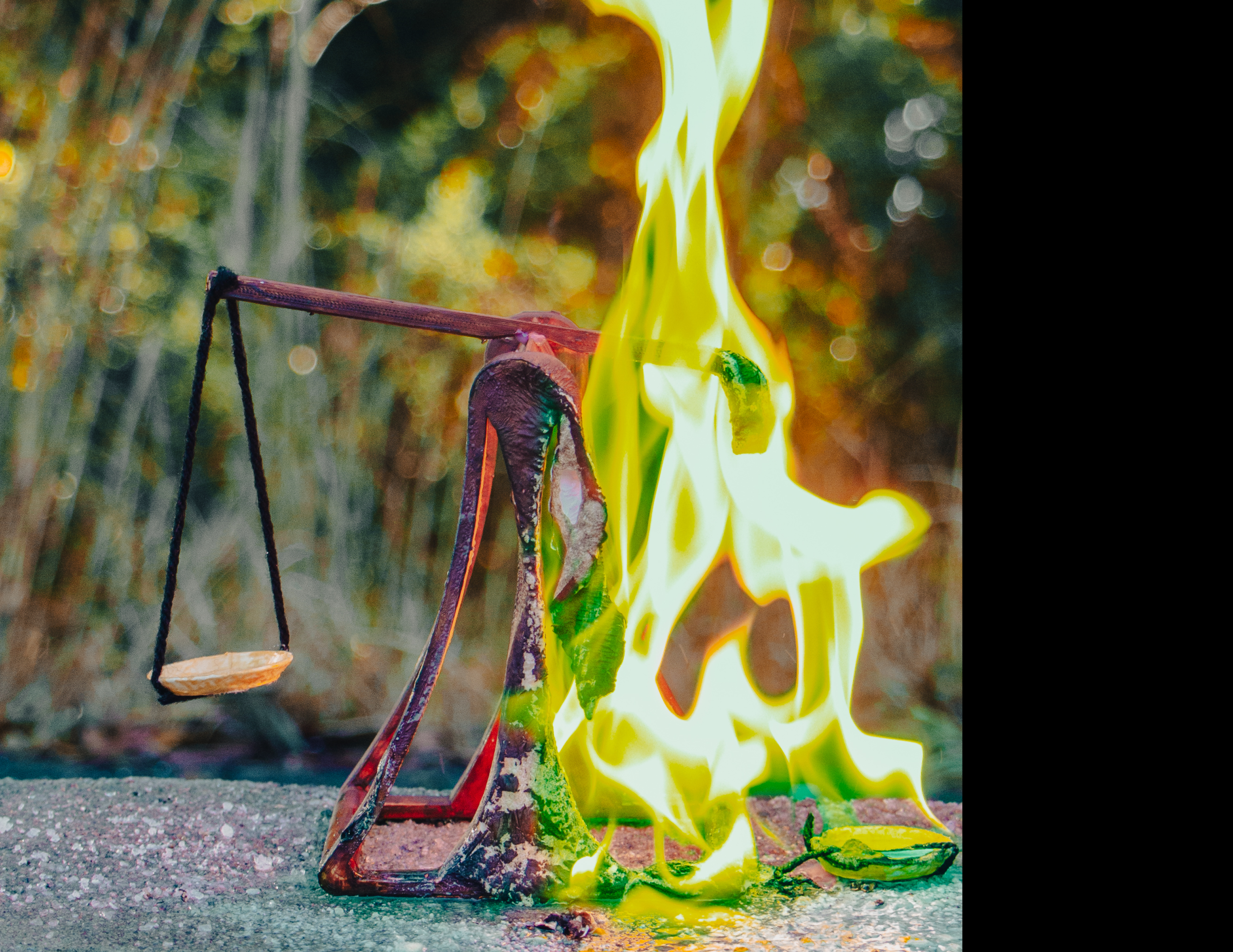
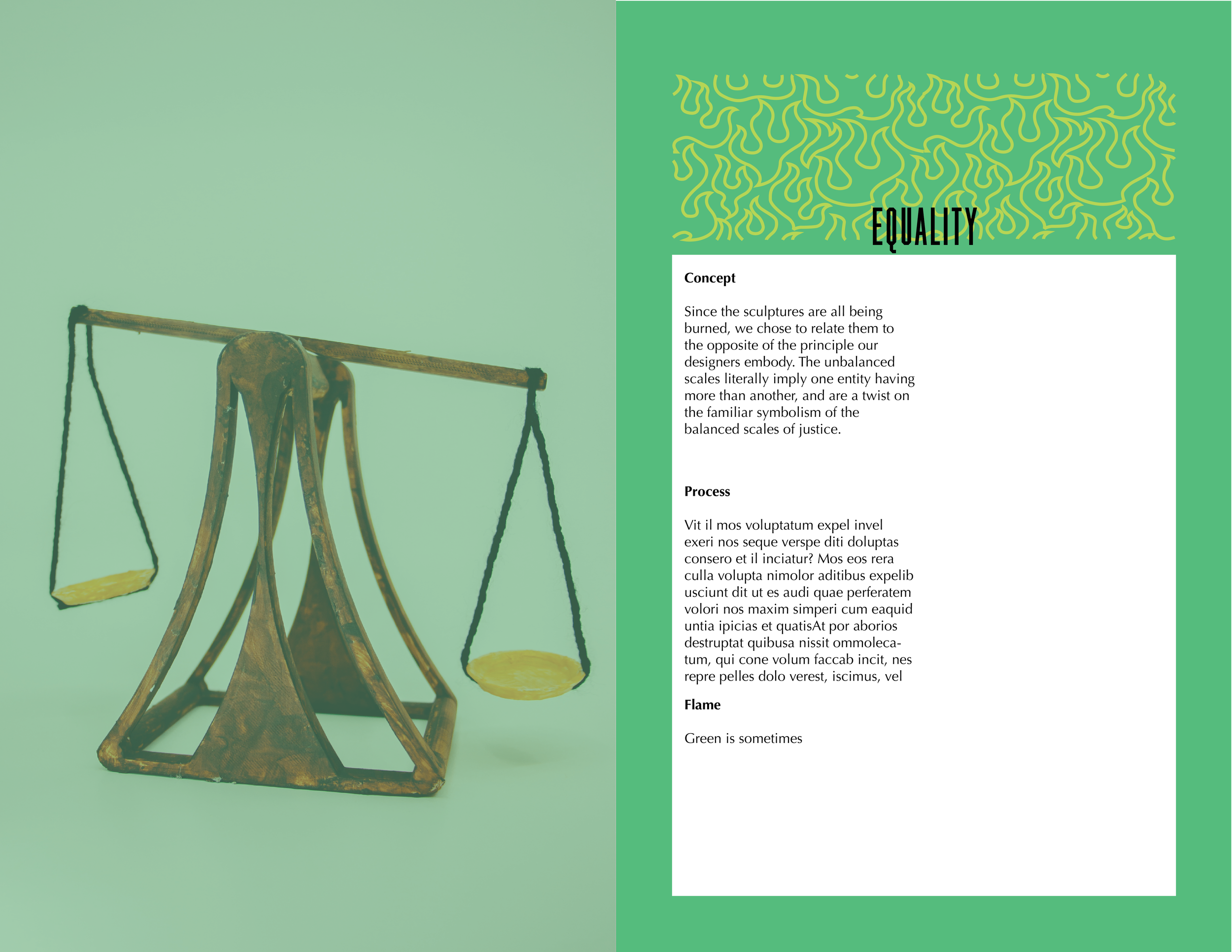
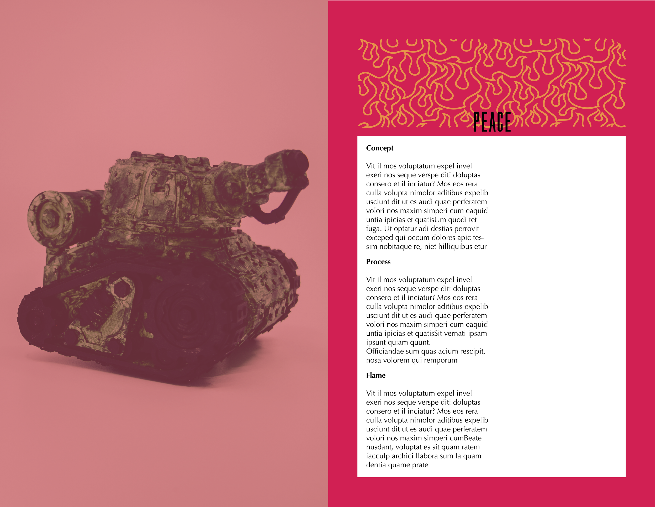
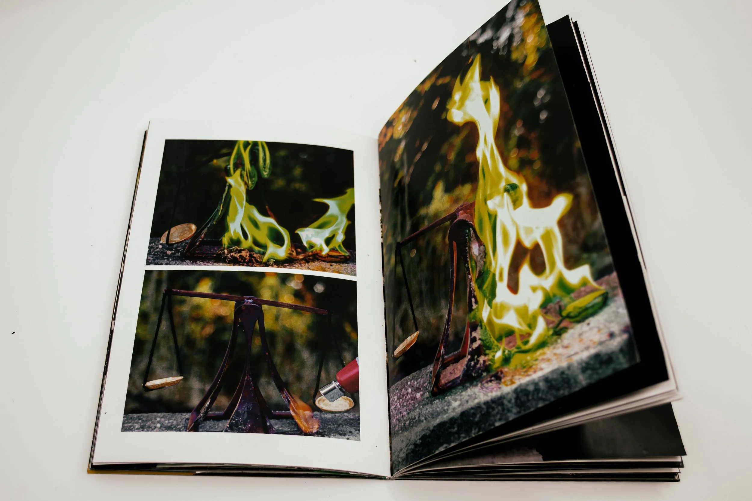
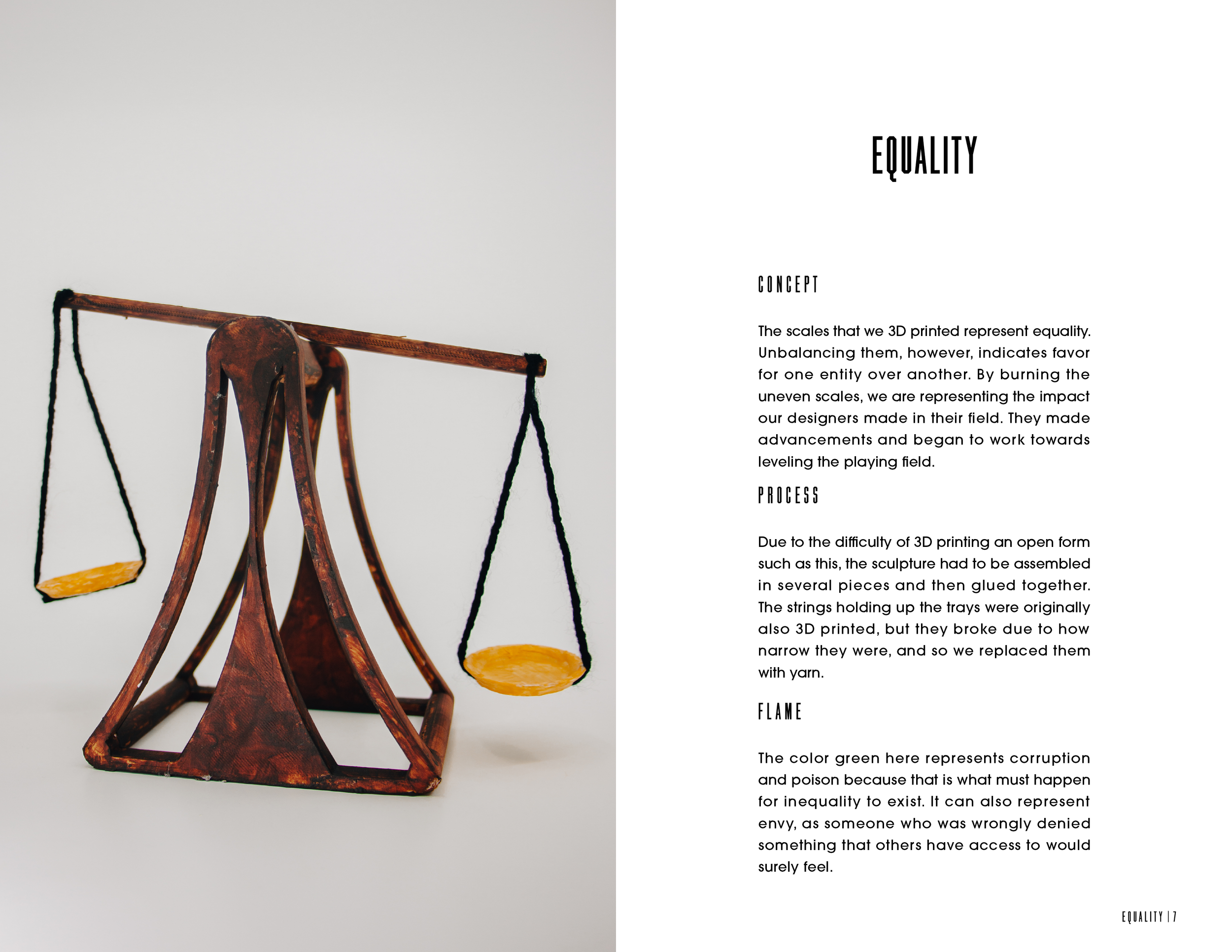
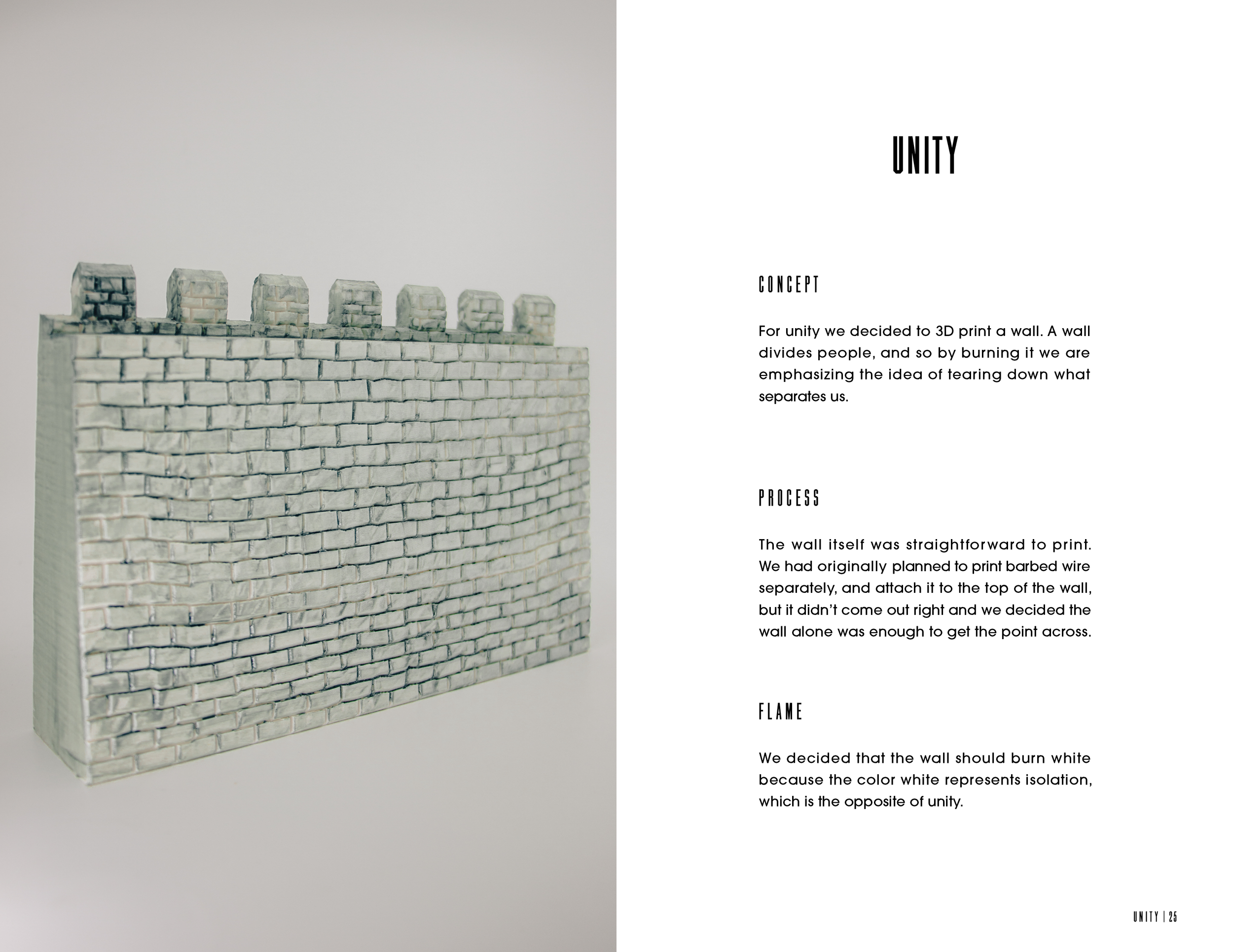
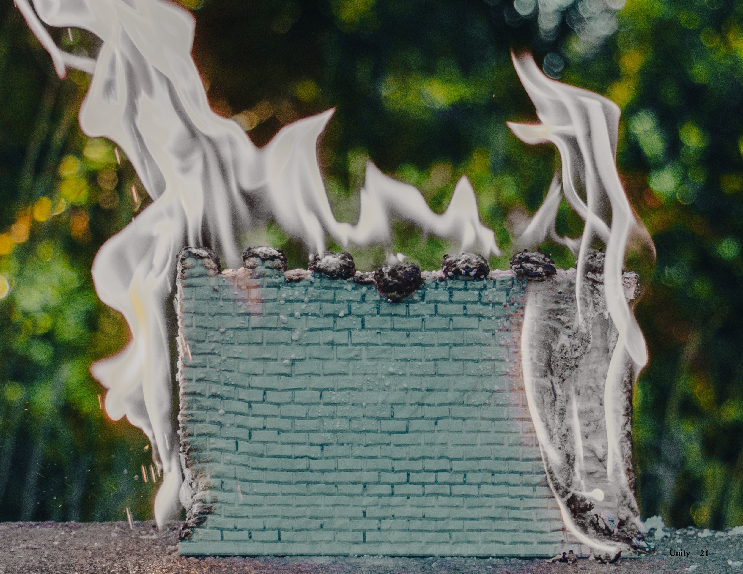
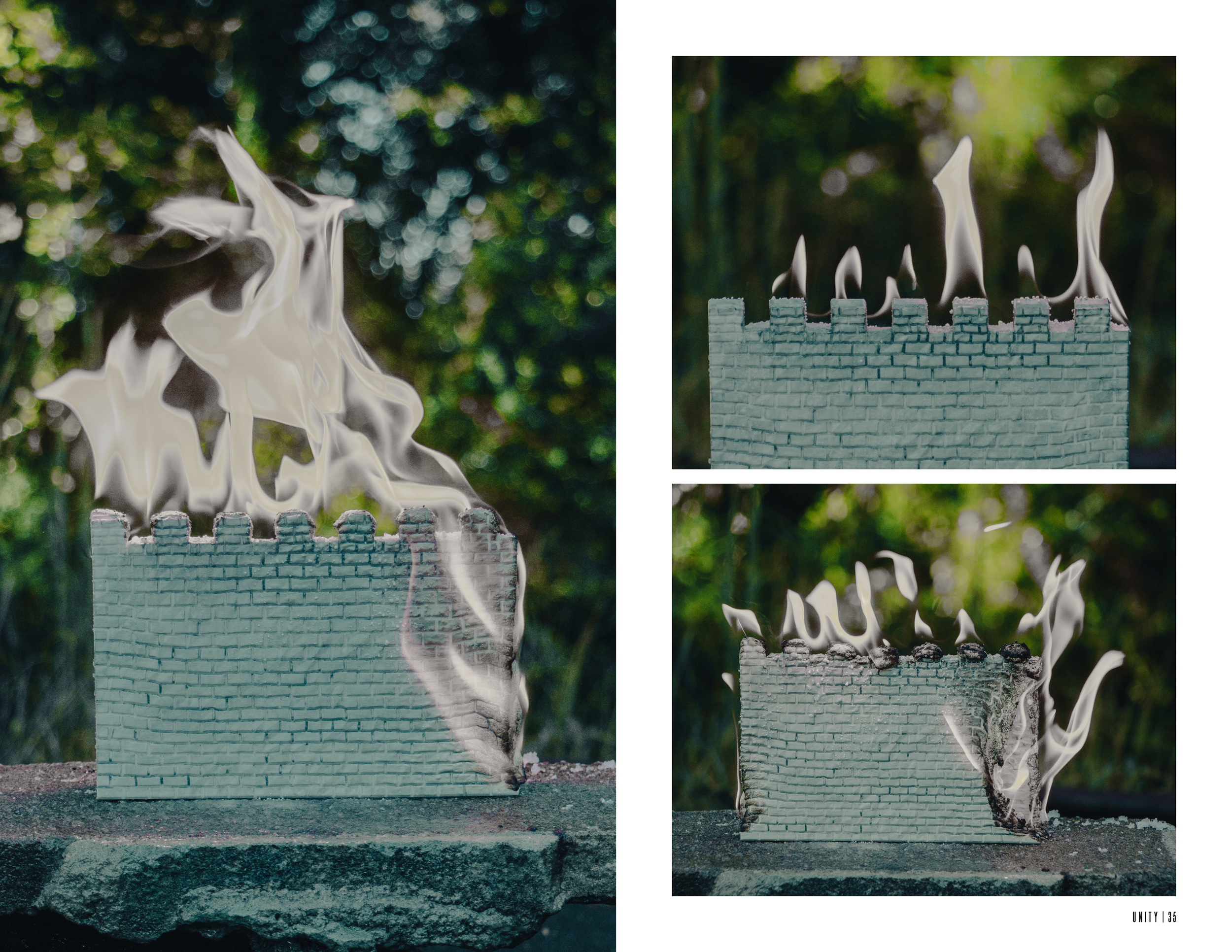
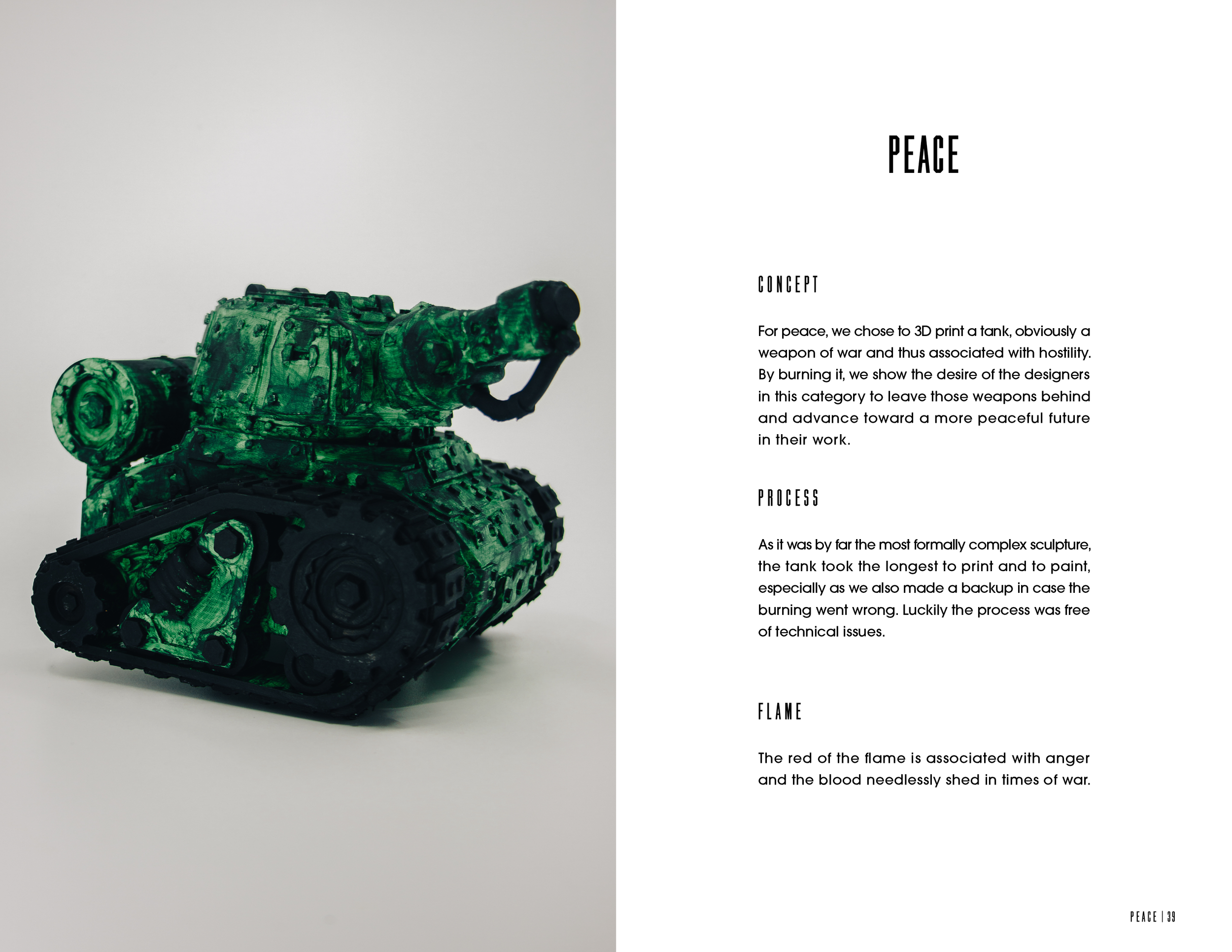
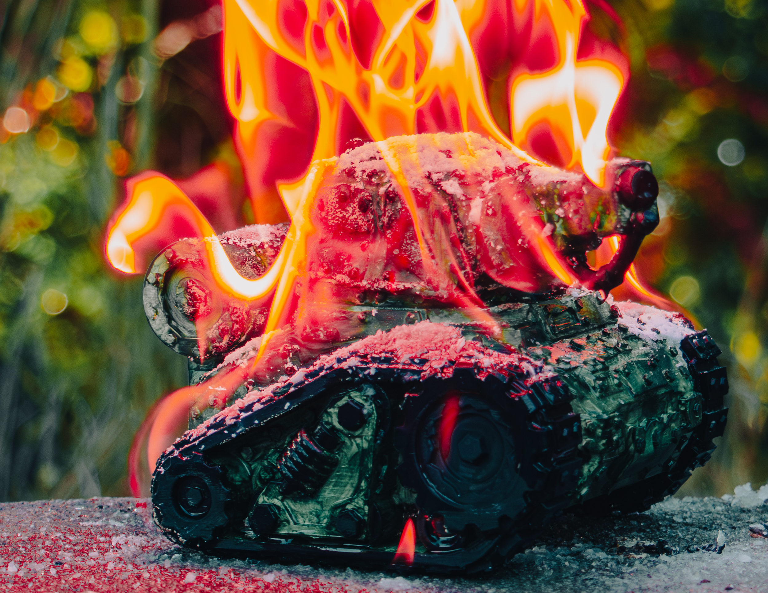
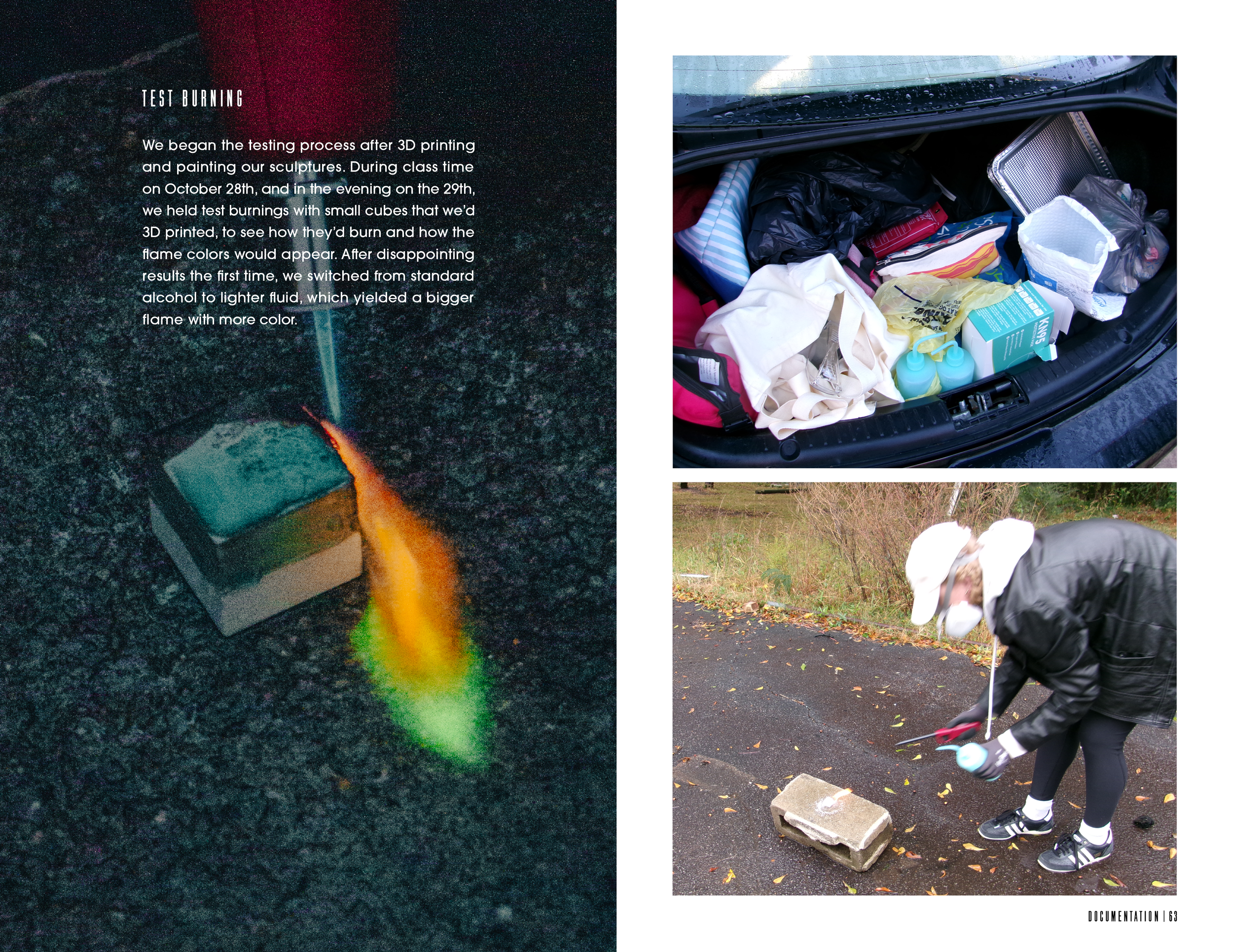
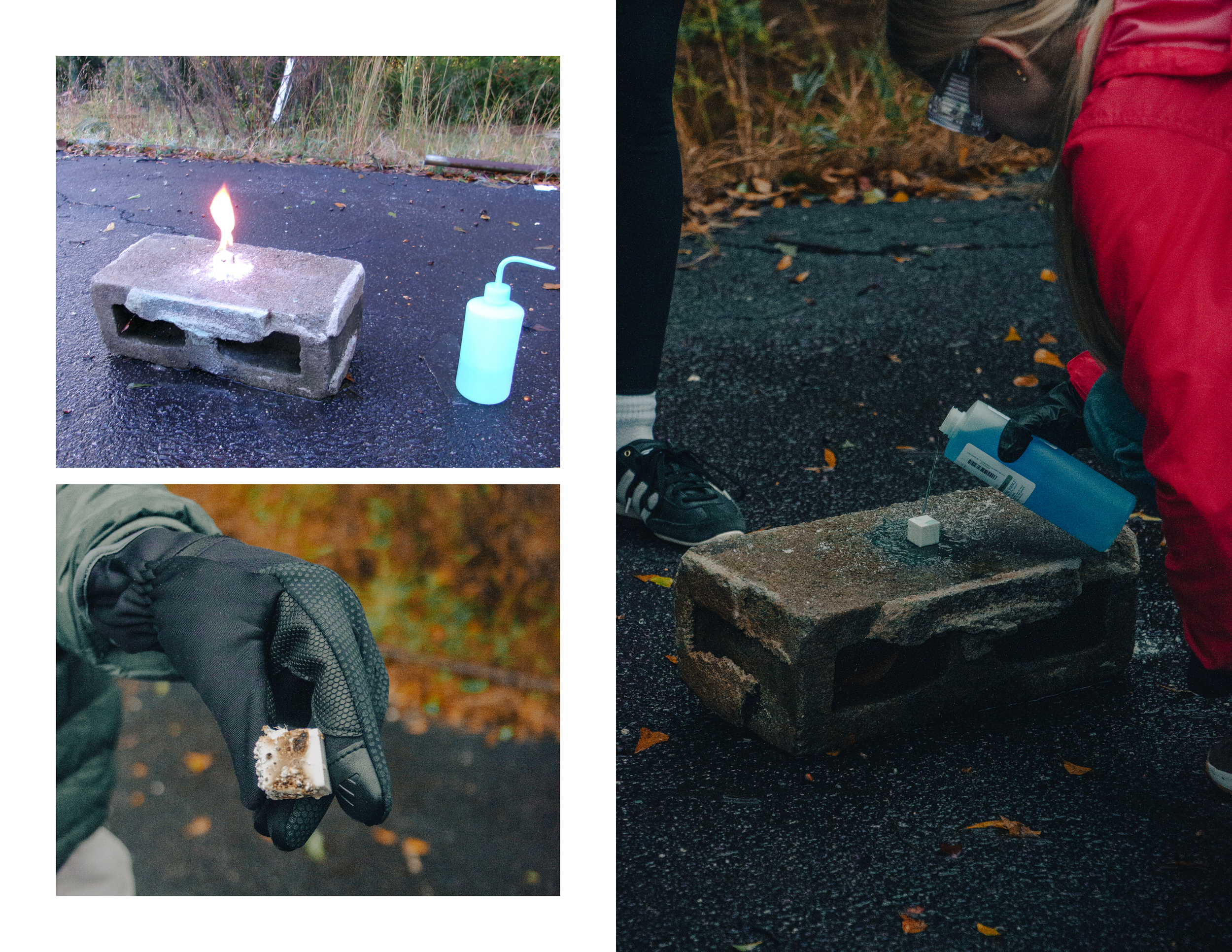
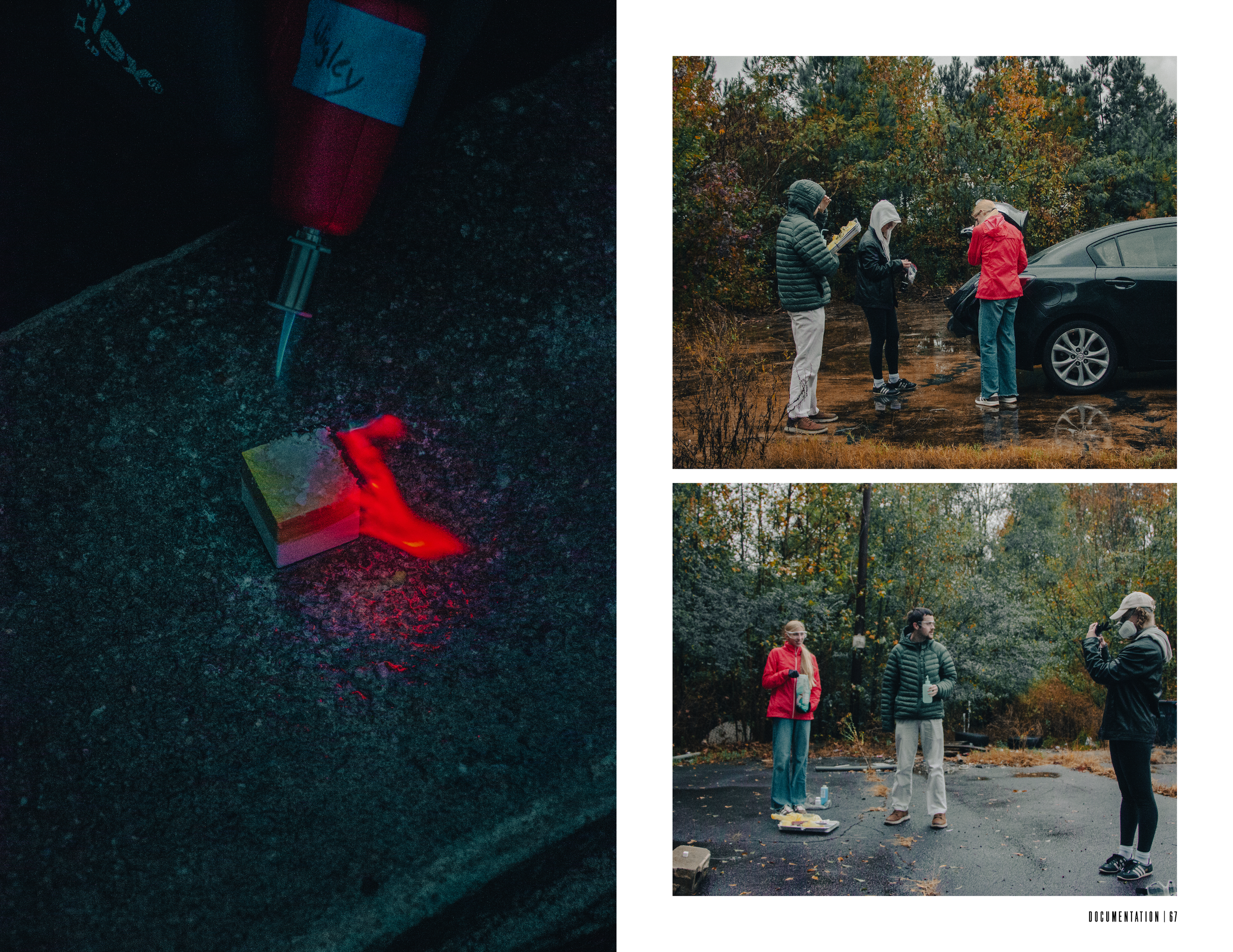
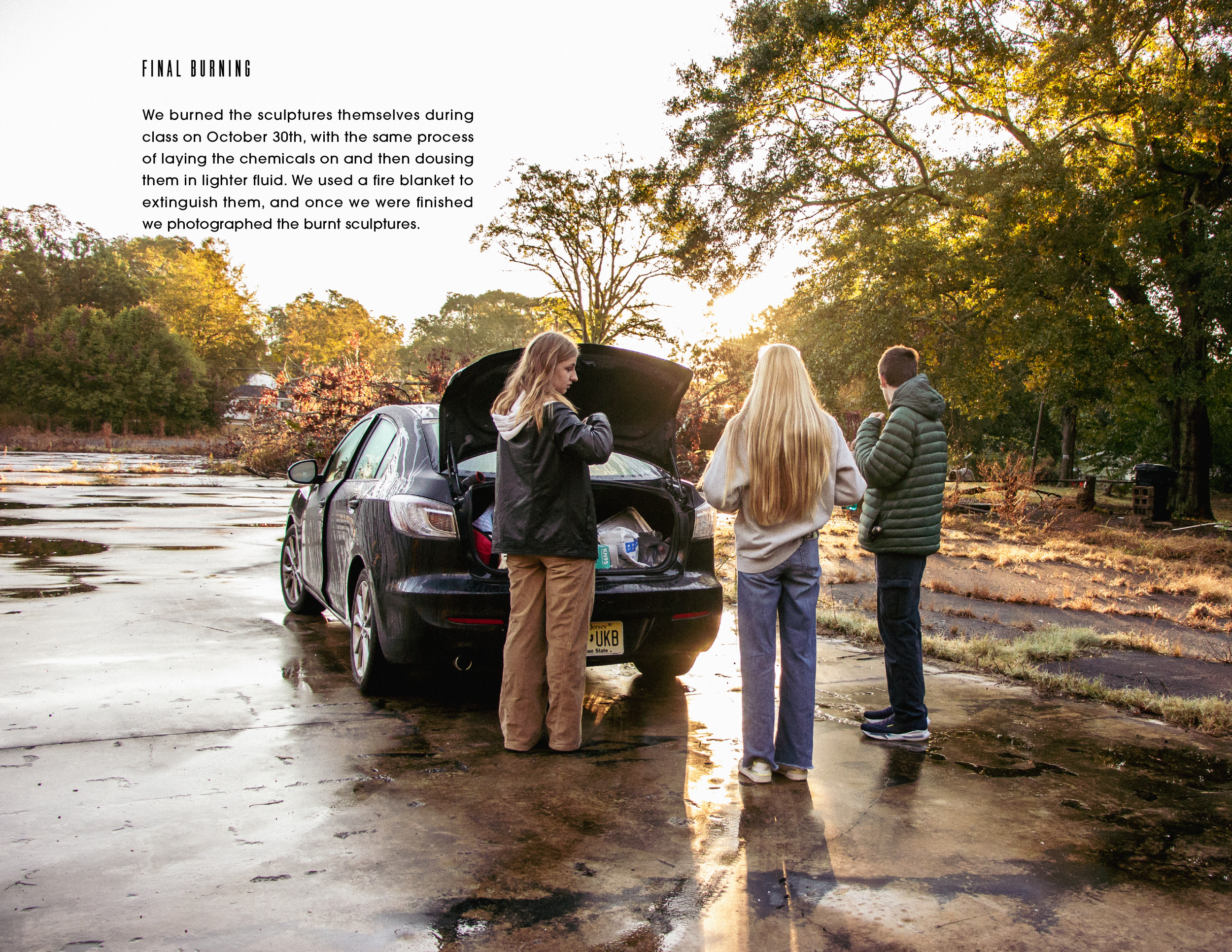
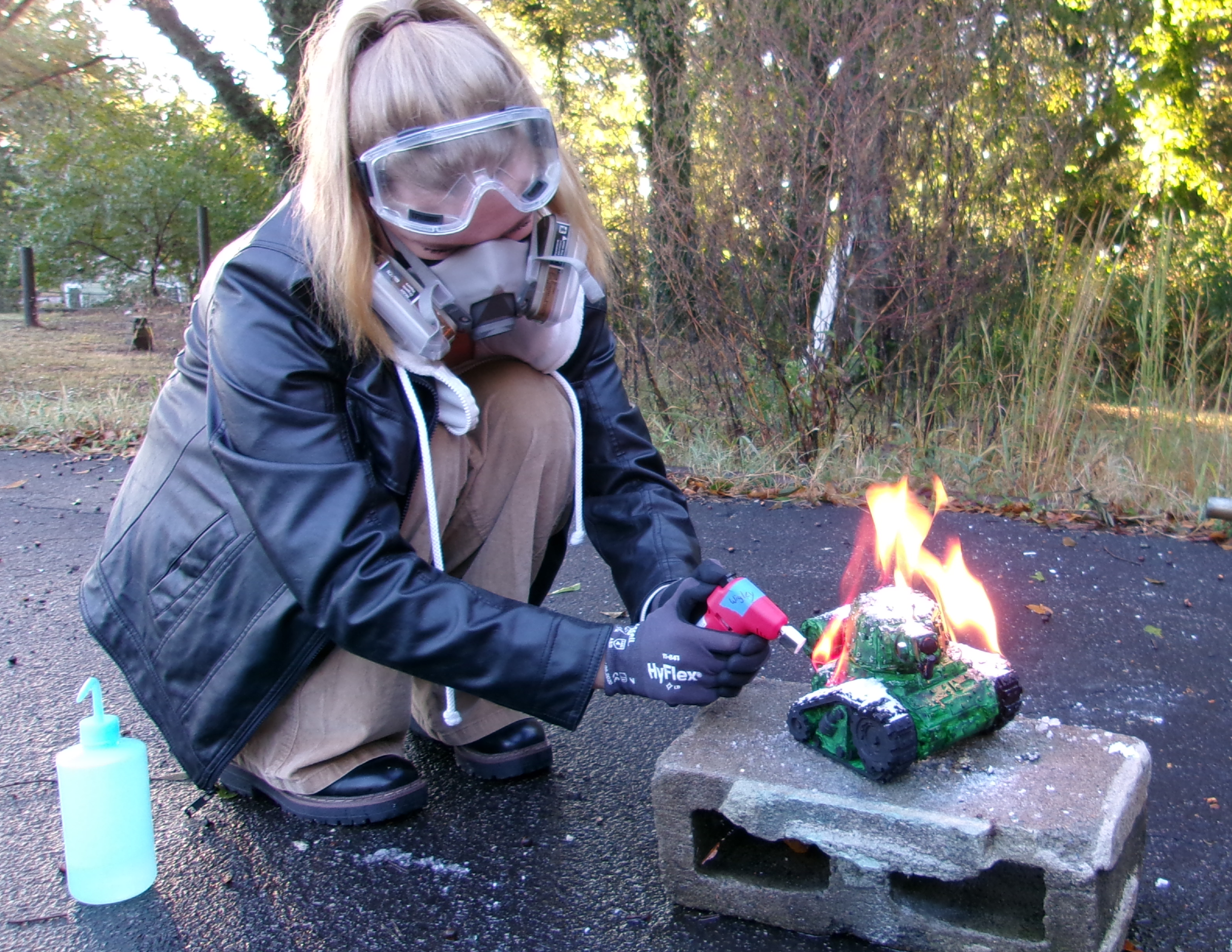
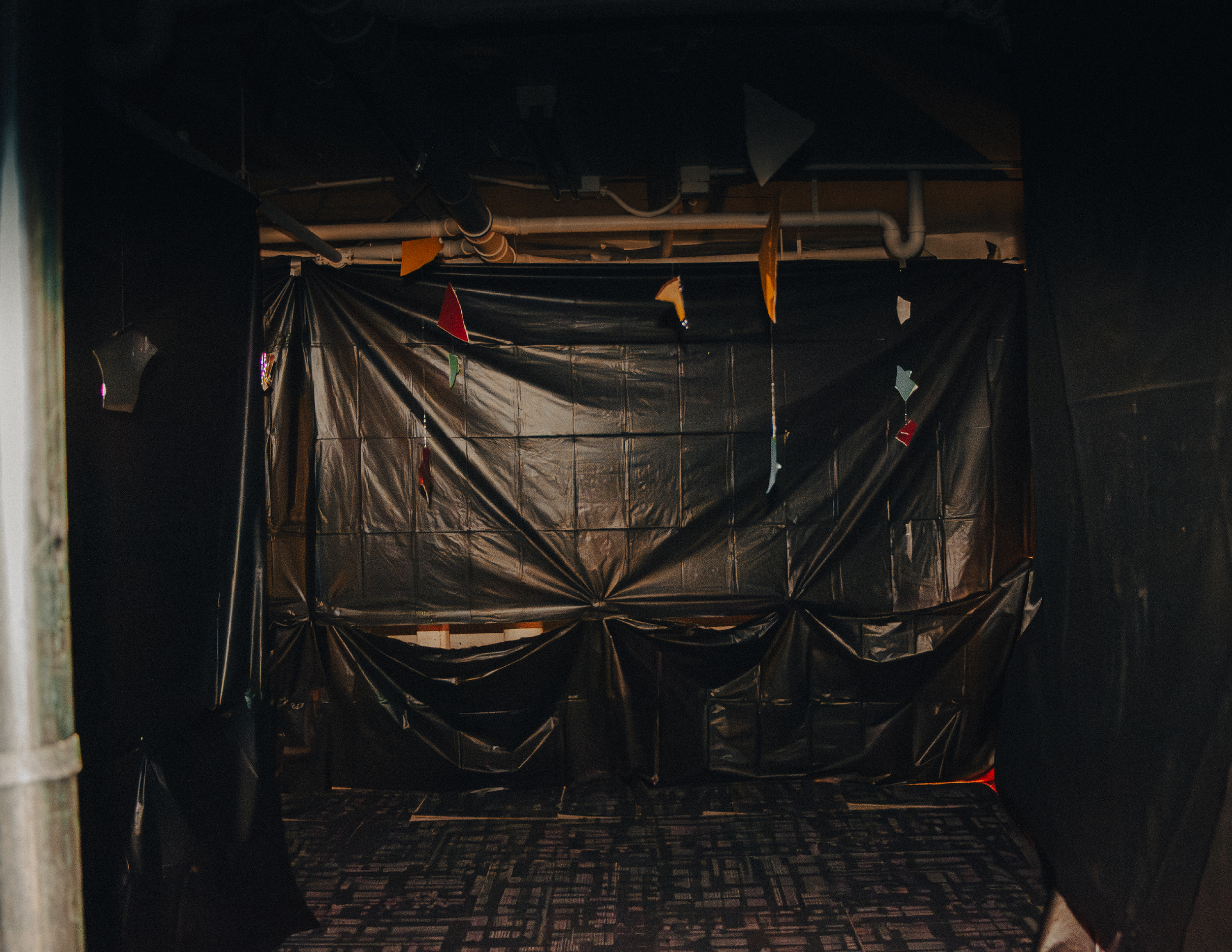
Our visual identity was based around photography, wherein we 3D printed objects that represented the issues in question, and burned them to show the damage that leaving them unaddressed will cause. We also colored the flames themselves, to give each section a distinct visual identity. For the Equality section, we had a set of unbalanced scales, and the flame is green to represent corruption.
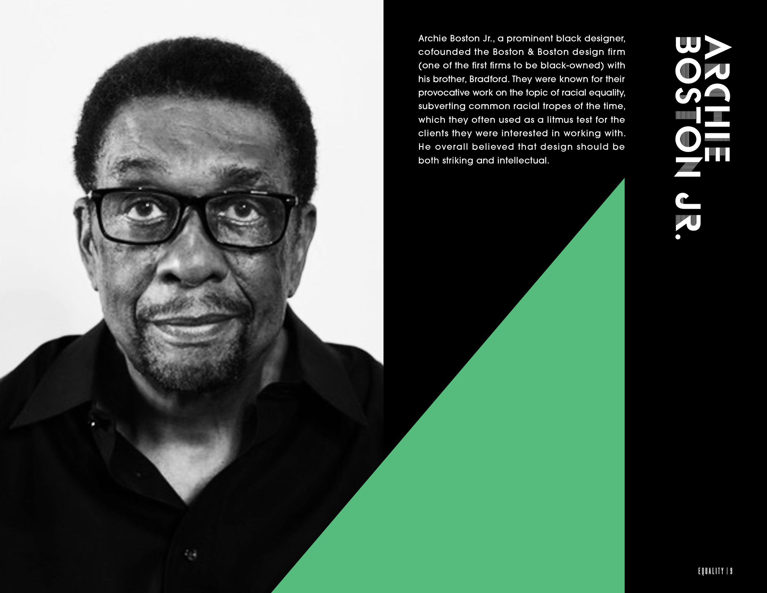
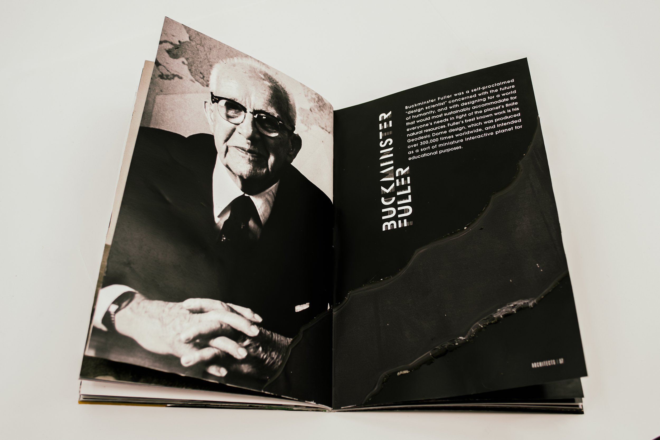
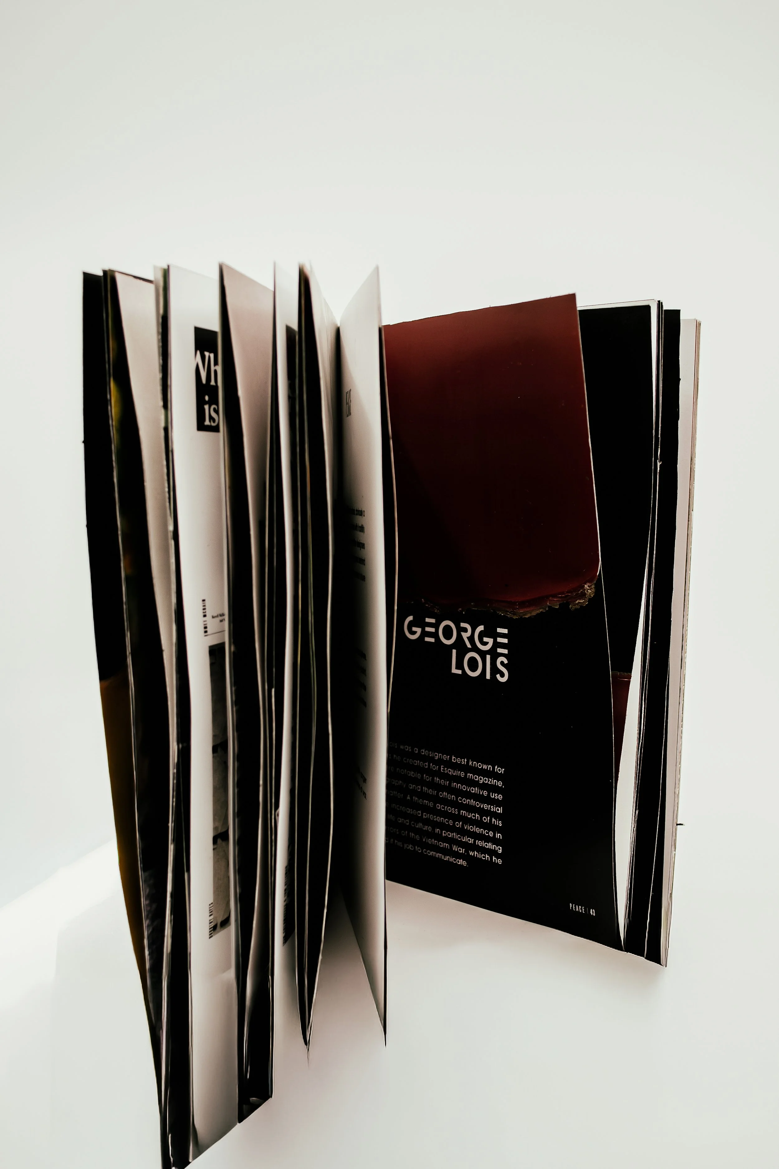
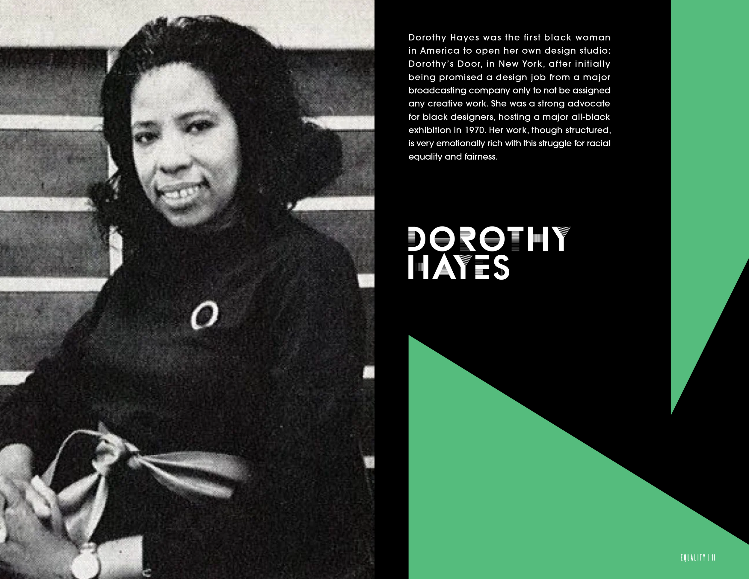
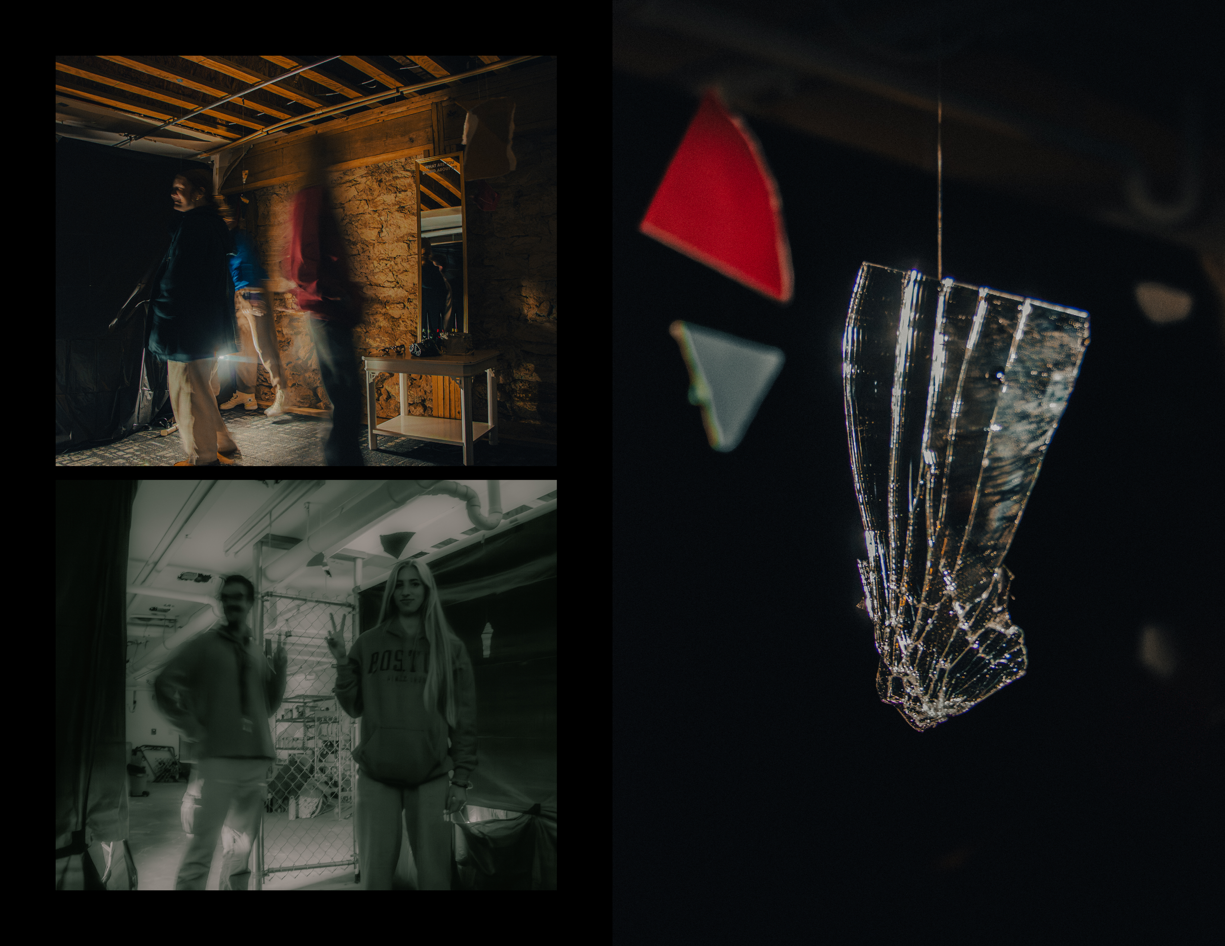
Each designer has their own spread, explaining what their work was primarily about. The shapes, which are colored according to the color of the section’s flame, are made with cut paper that’s burned at the edges in the print version.
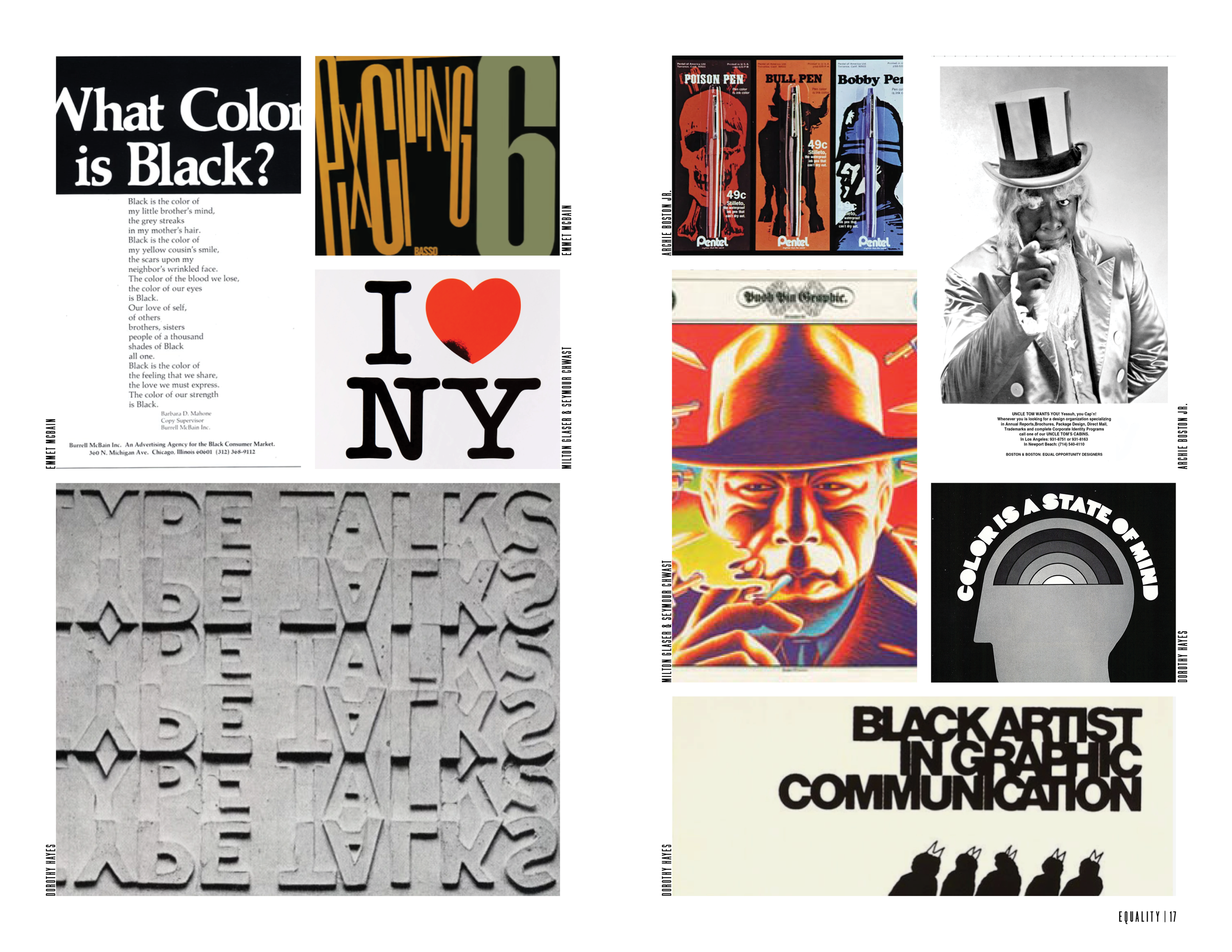
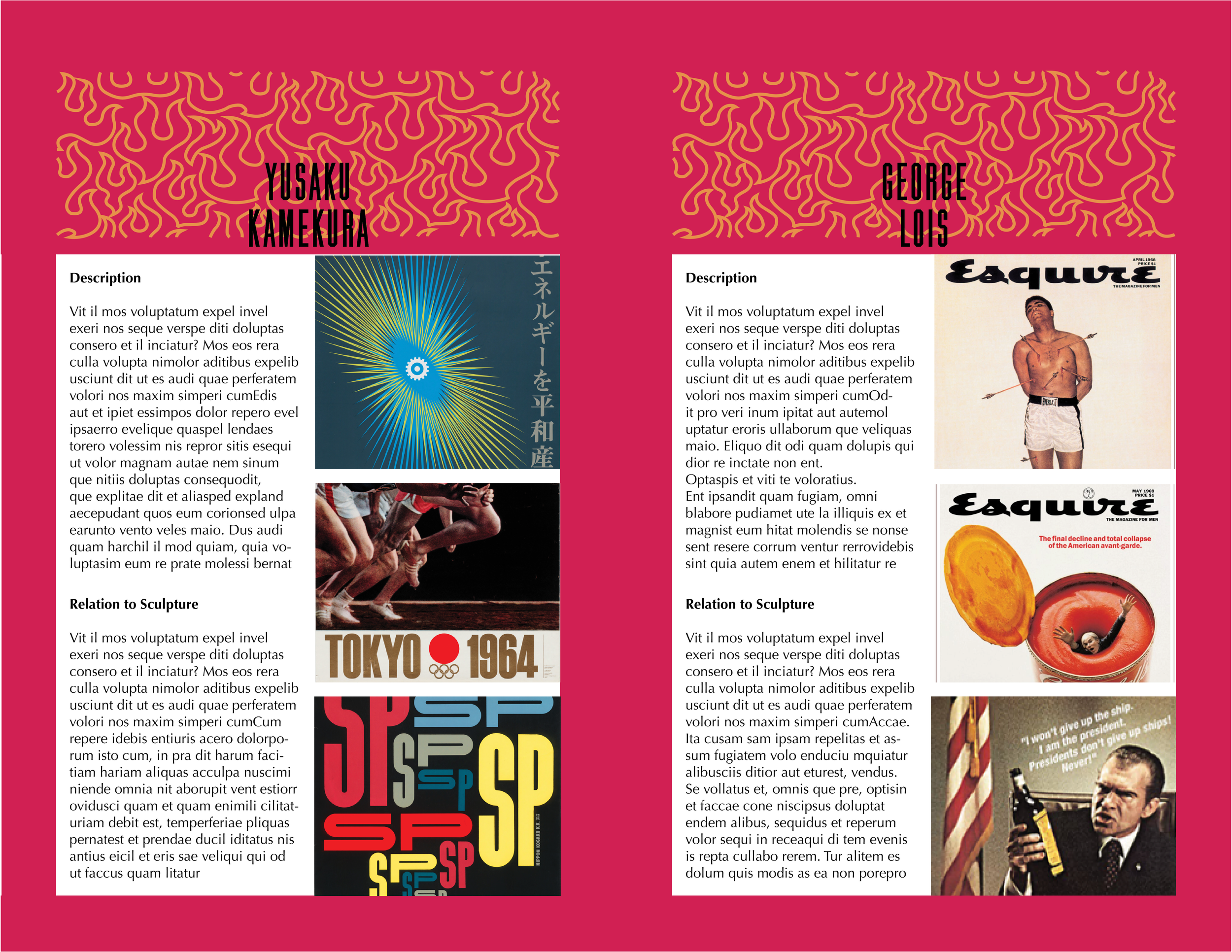
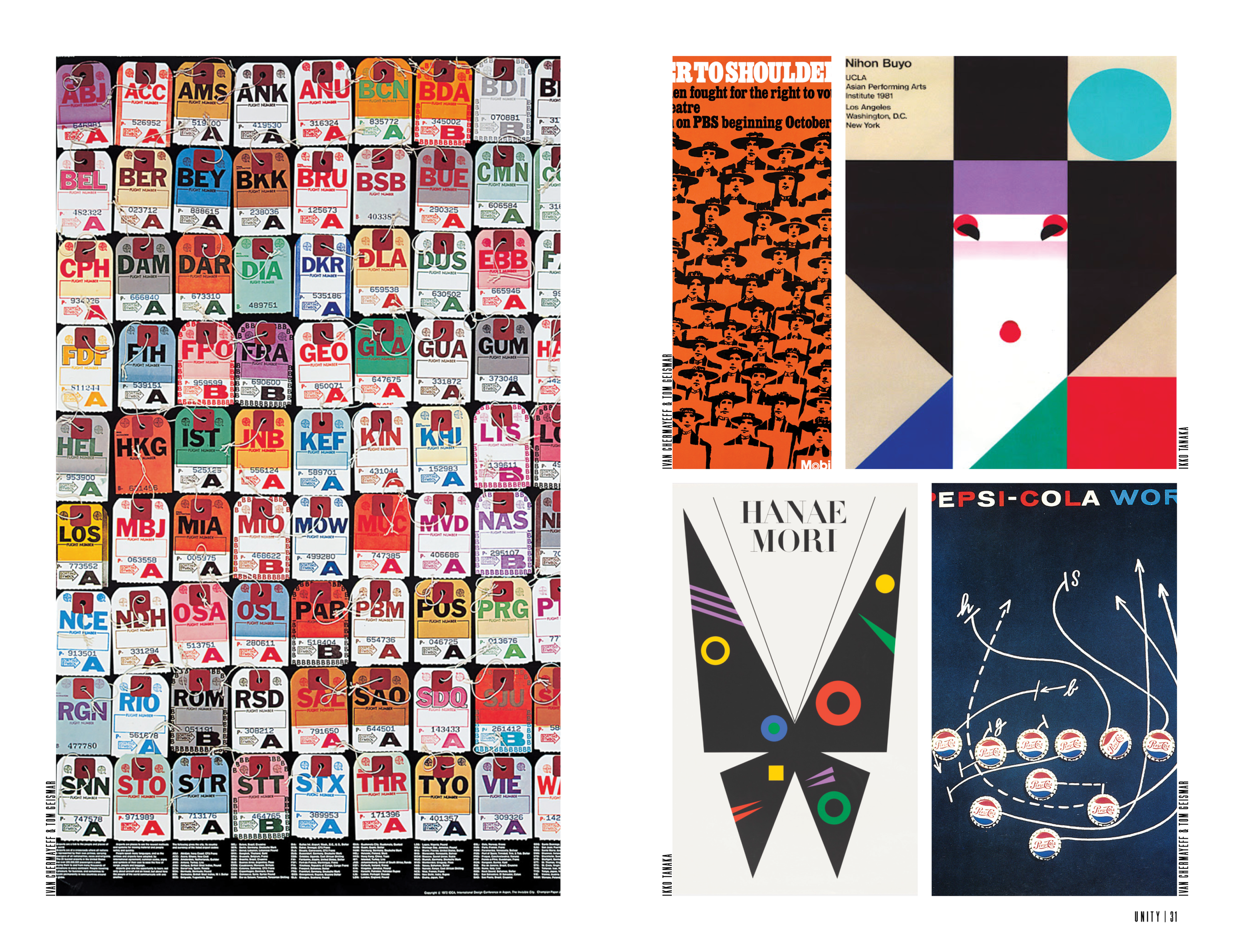
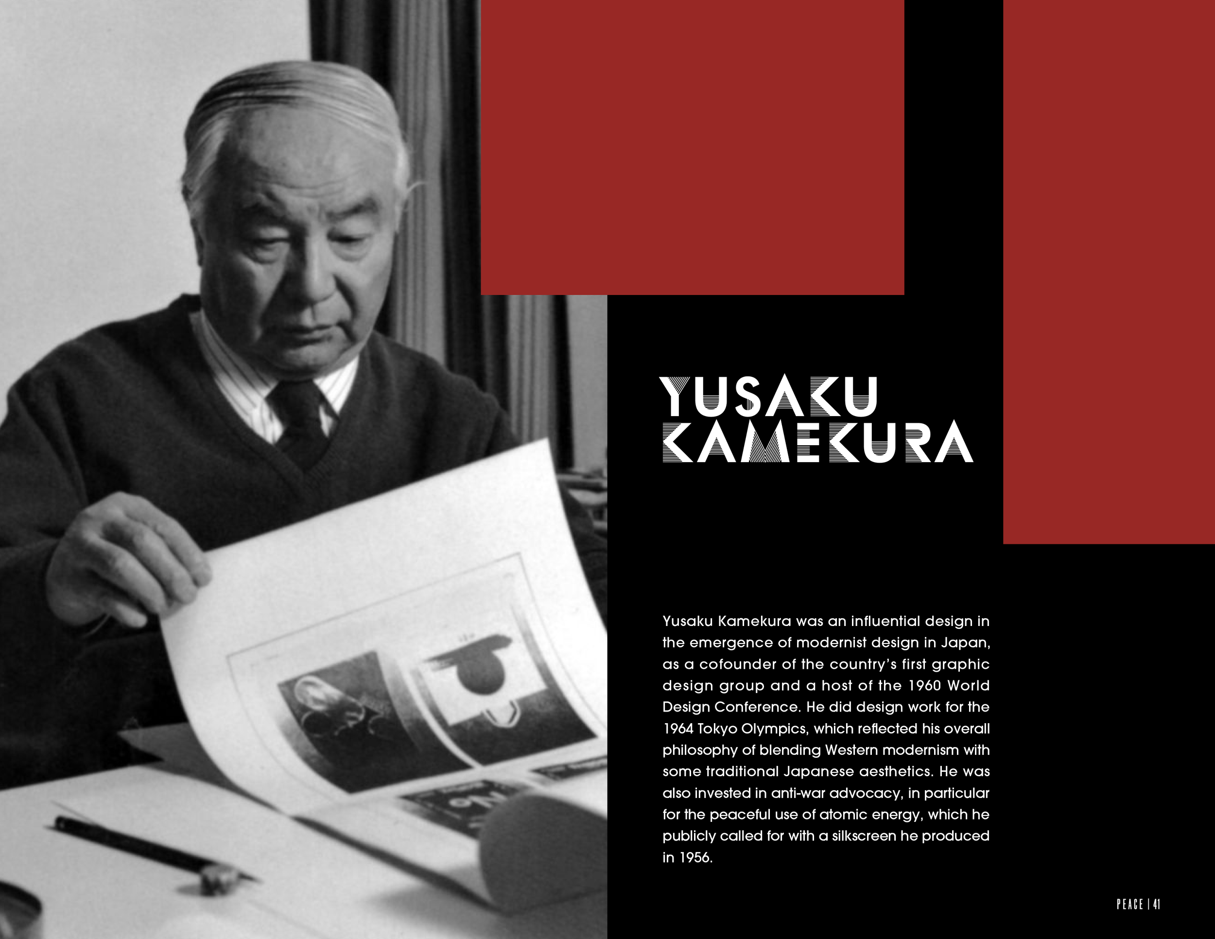
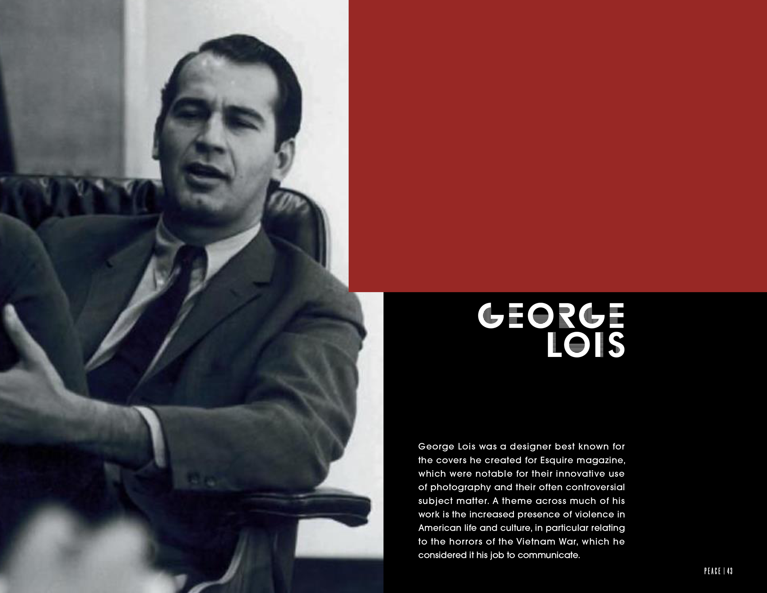
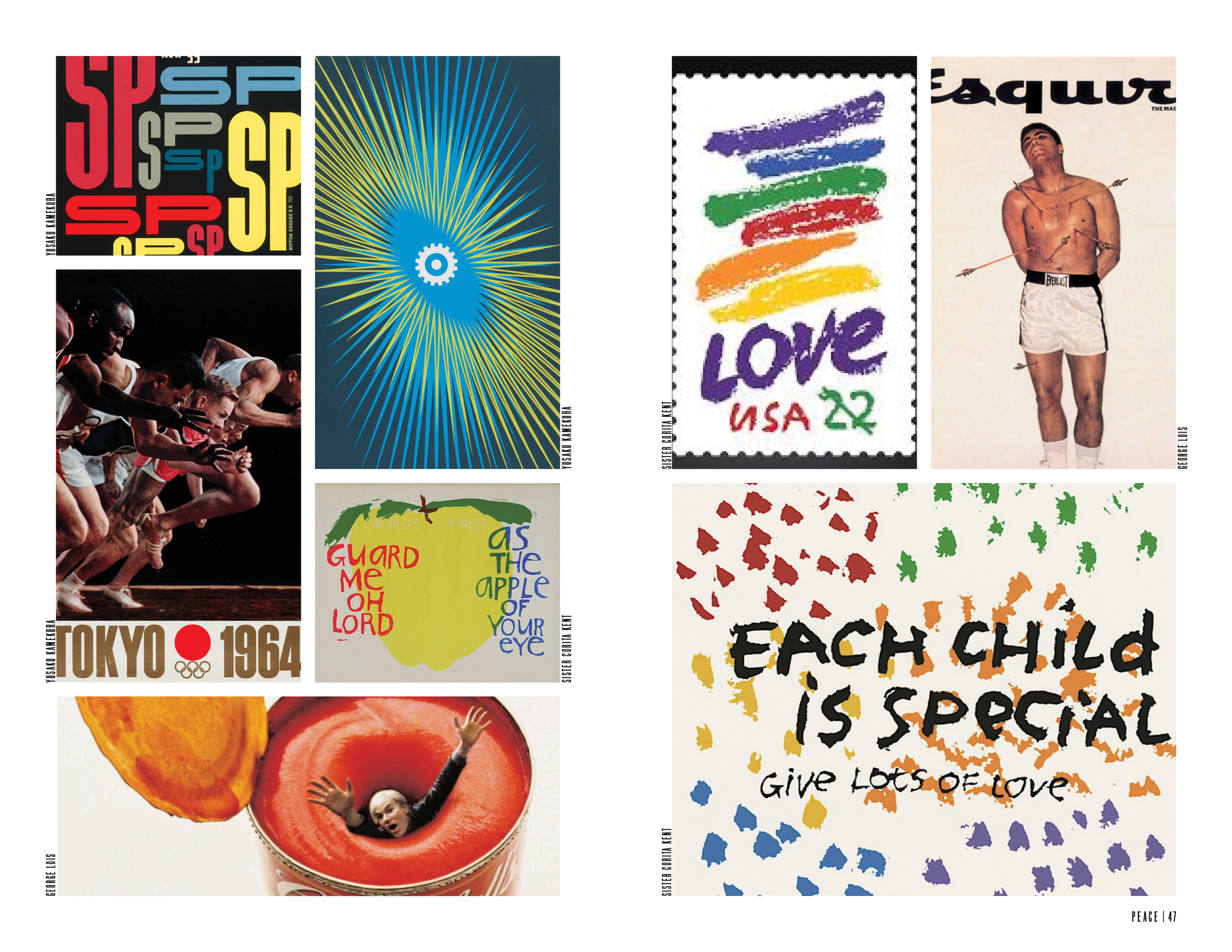
At the end of each section, we dedicated a spread to showing a bit of the artists’ work. There isn’t much attention on this, since we wanted the focus to be on what we did, but it helps to get a sense of what we’re talking about in each designer’s individual spread.
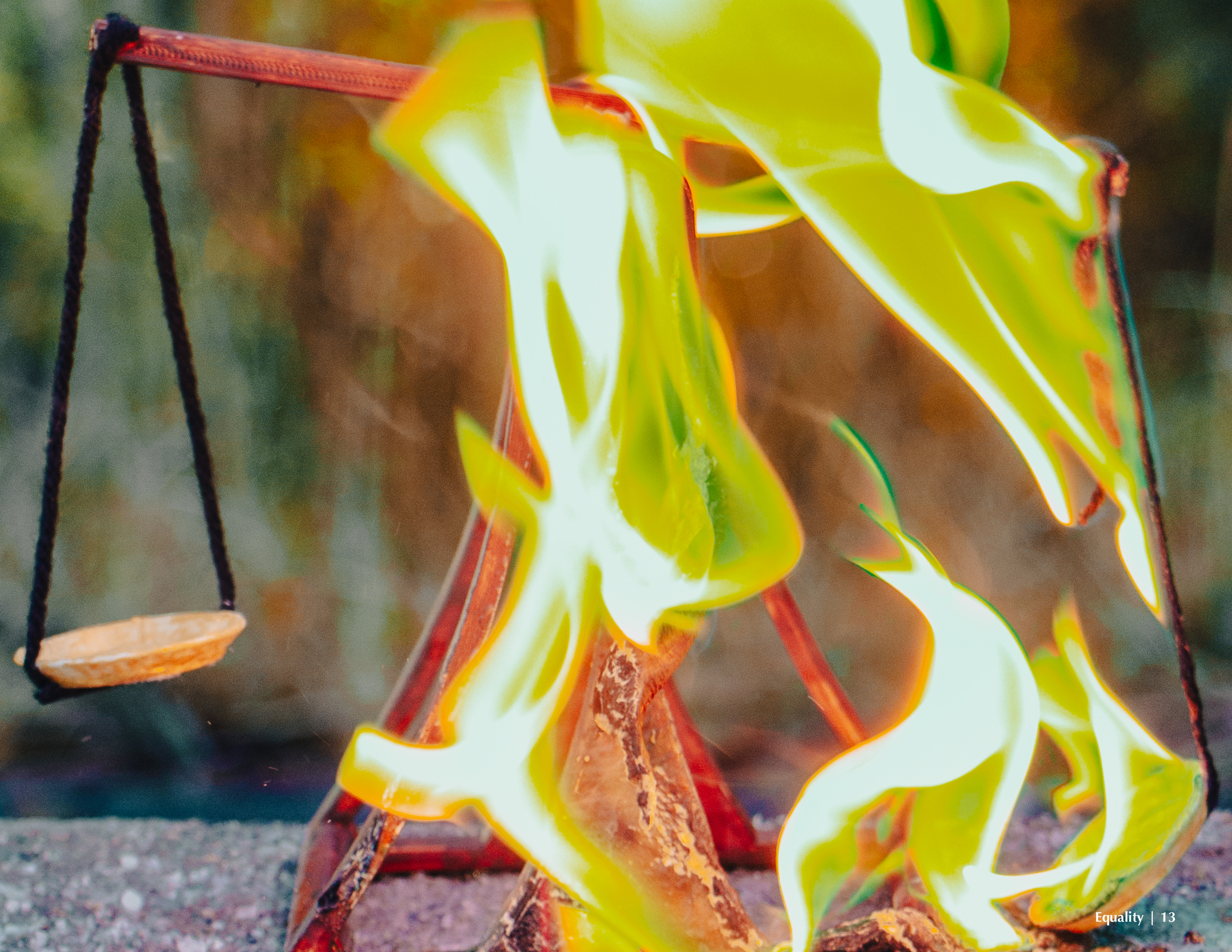
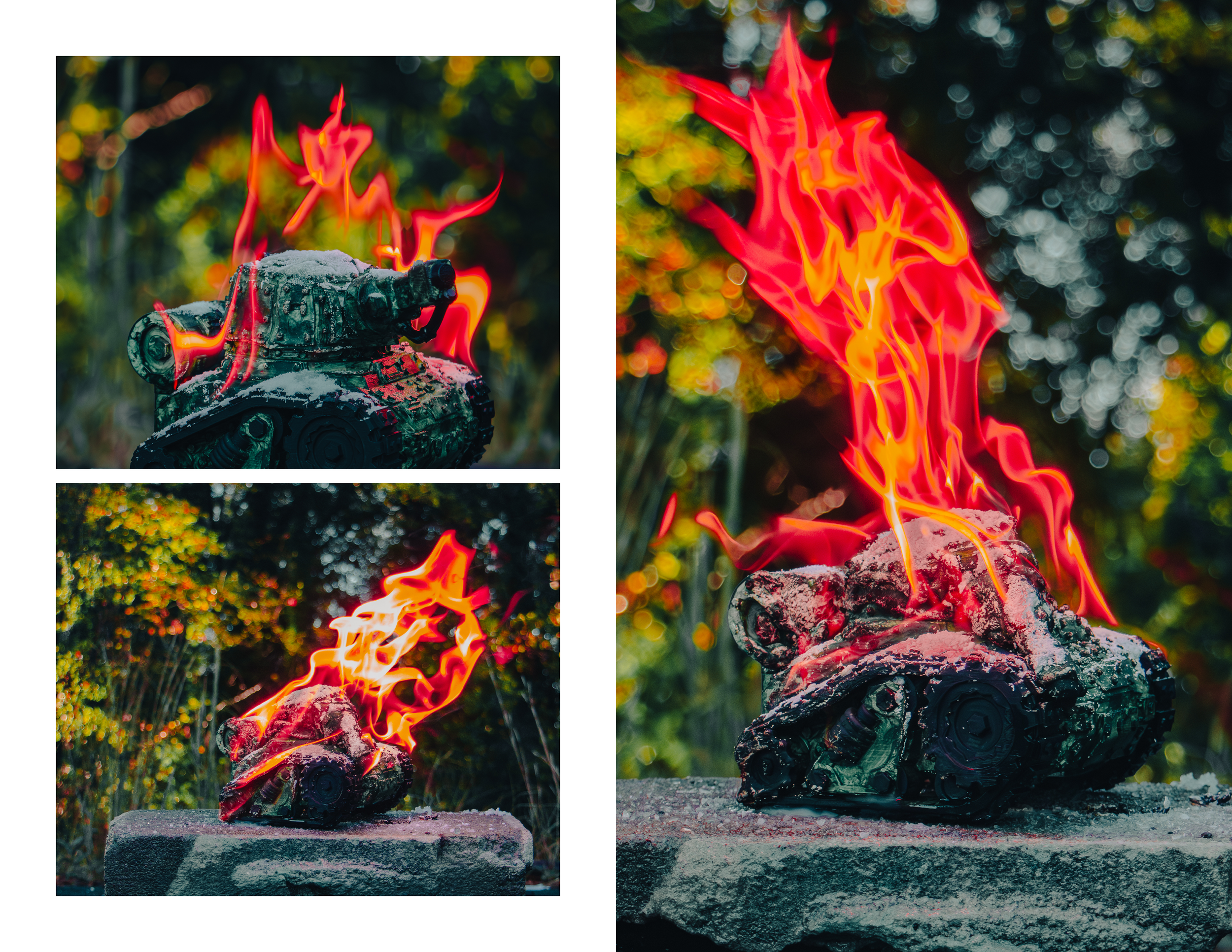
And finally, we show a few more images of the flame itself.

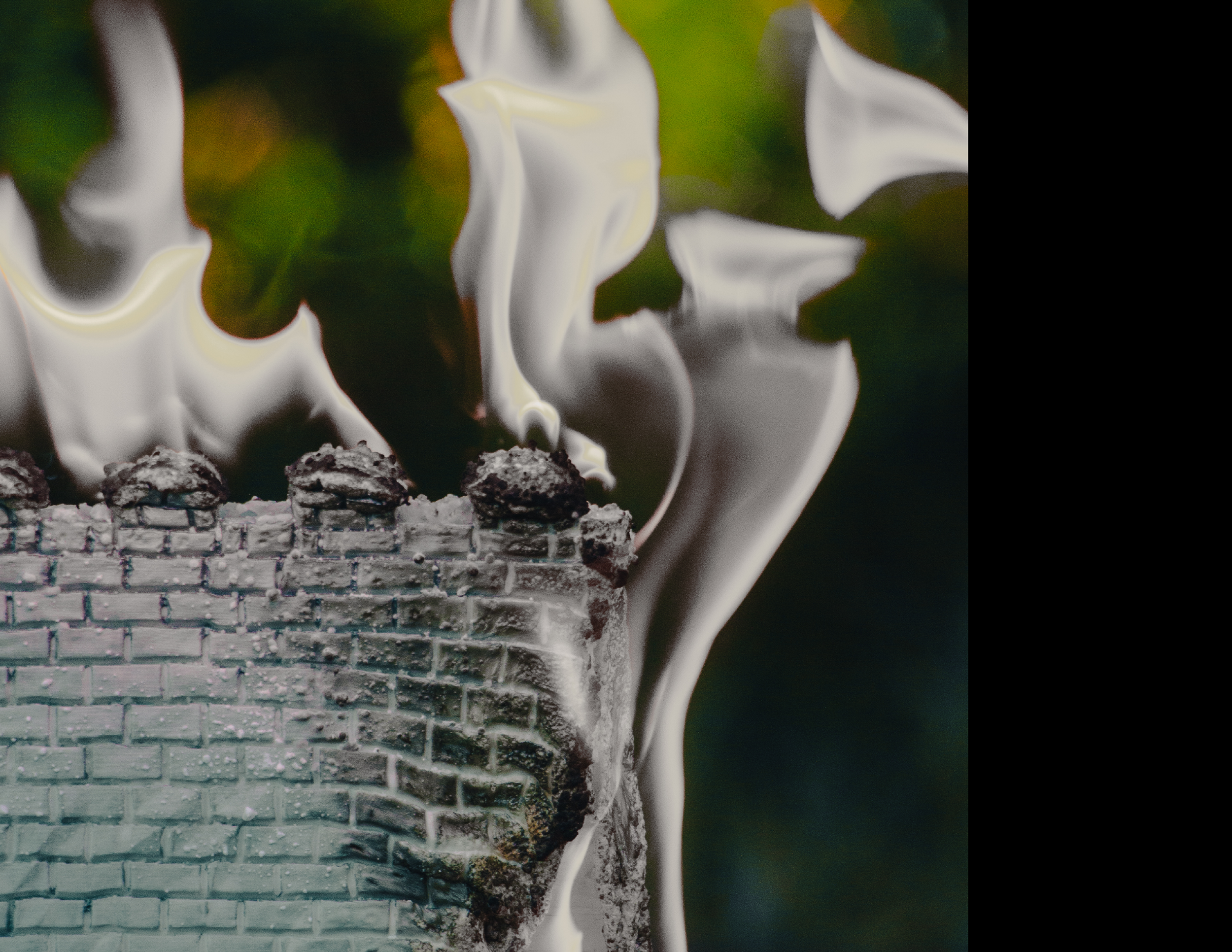
The Unity section is represented by a burning brick wall, an object which divides people, and the flame is white, standing for isolation.
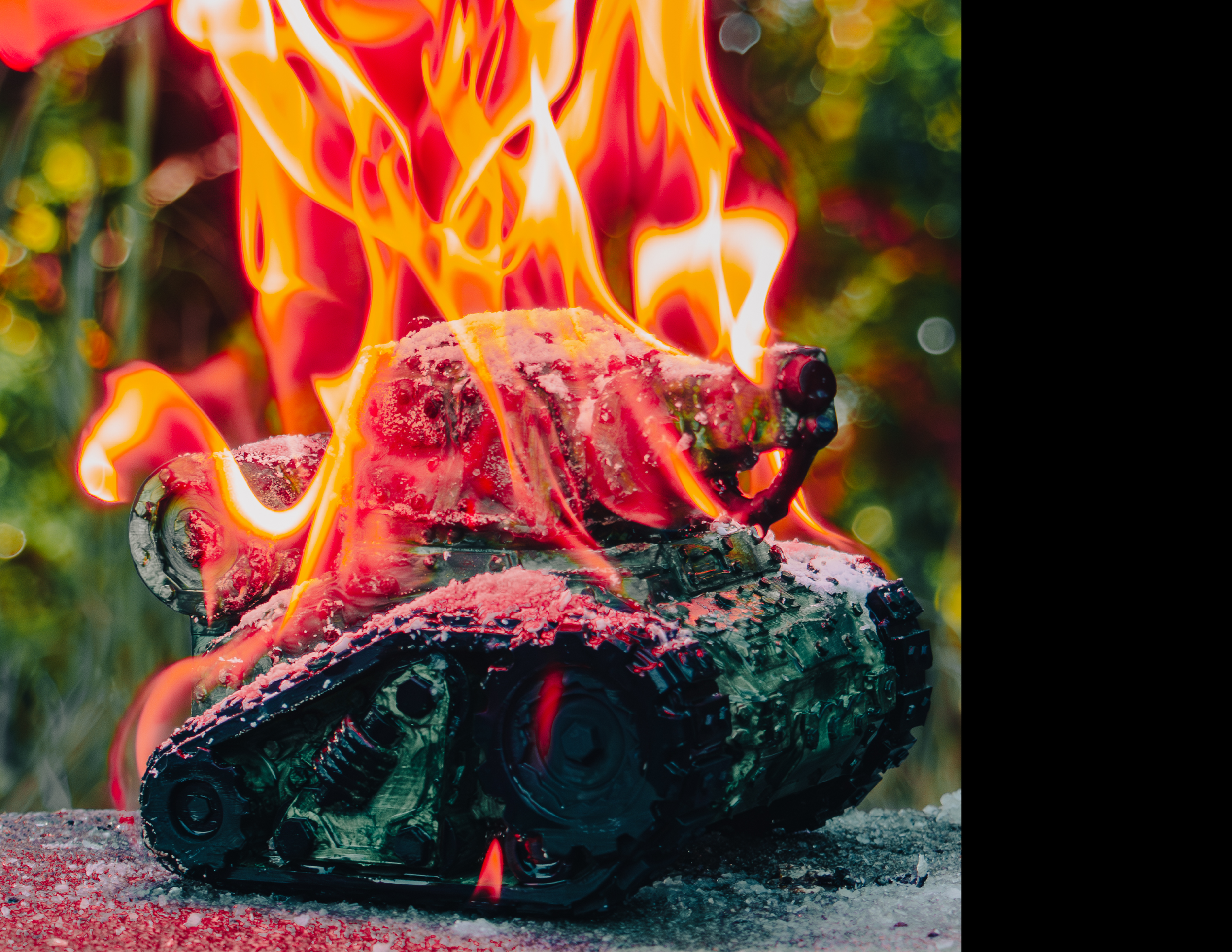
The Peace section shows a burning tank, obviously associated with war, engulfed in flames that are red, the color of aggression.
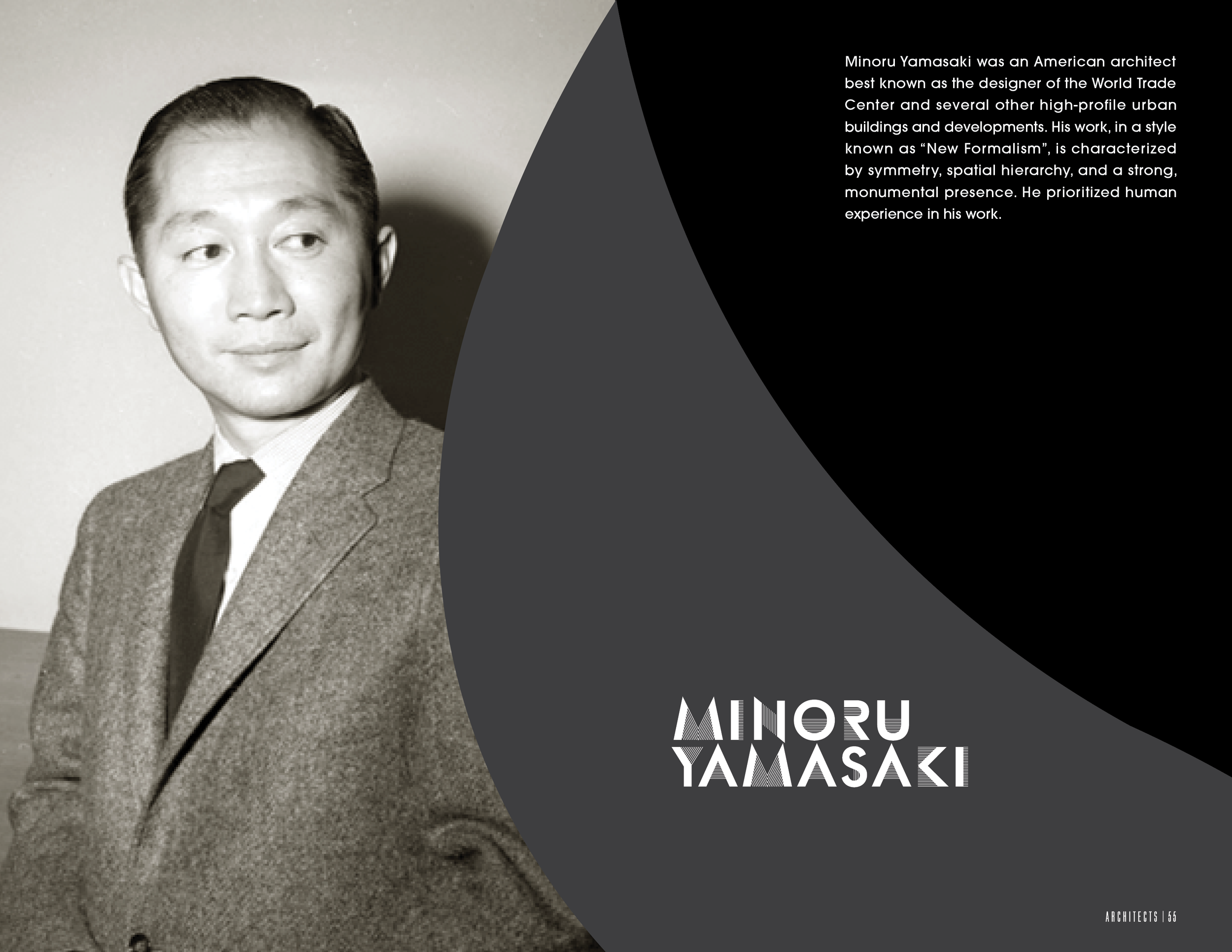
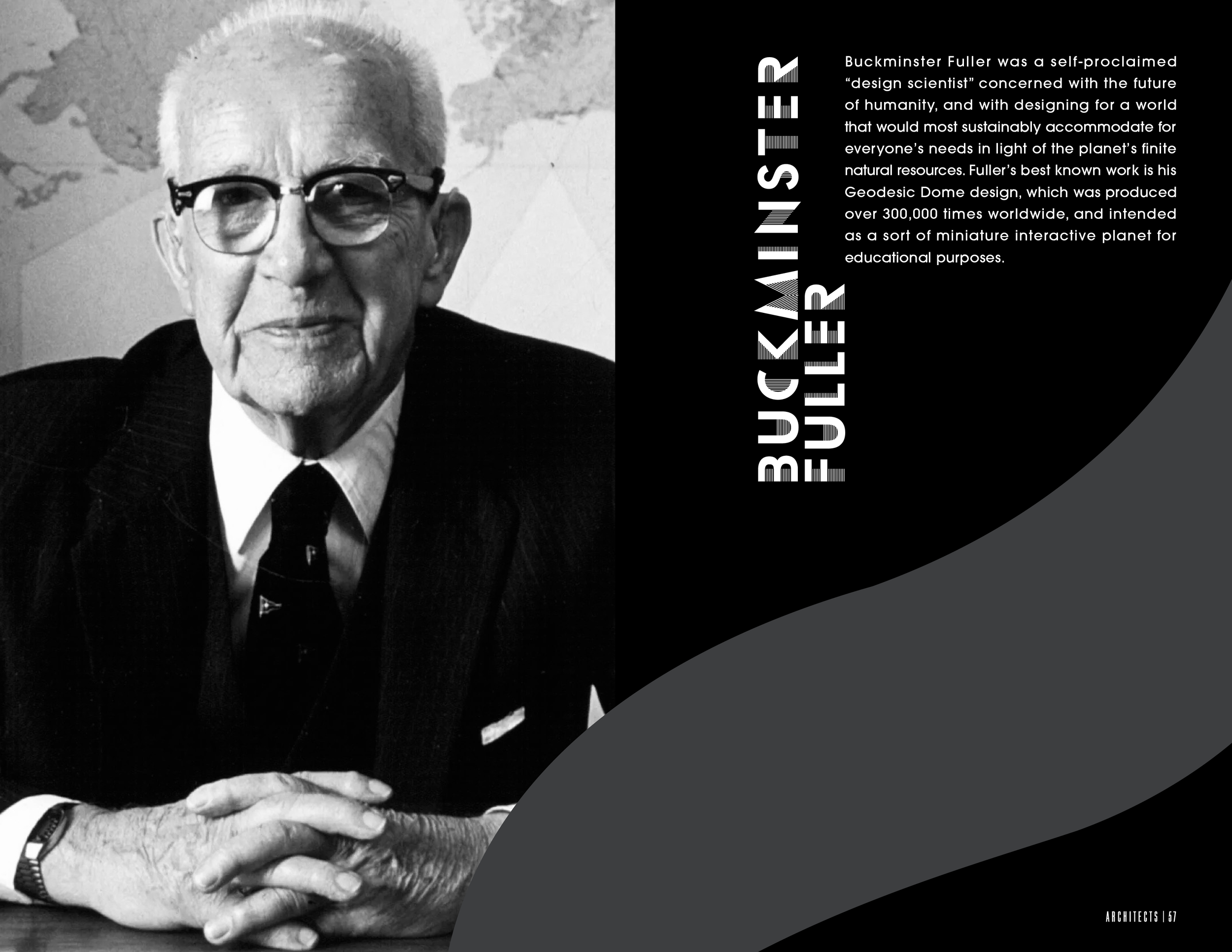
Not every designer we were assigned fit cleanly into a category, so we added a section for them, specifically those that were architects, and whose work matched our project because of its 3D nature.
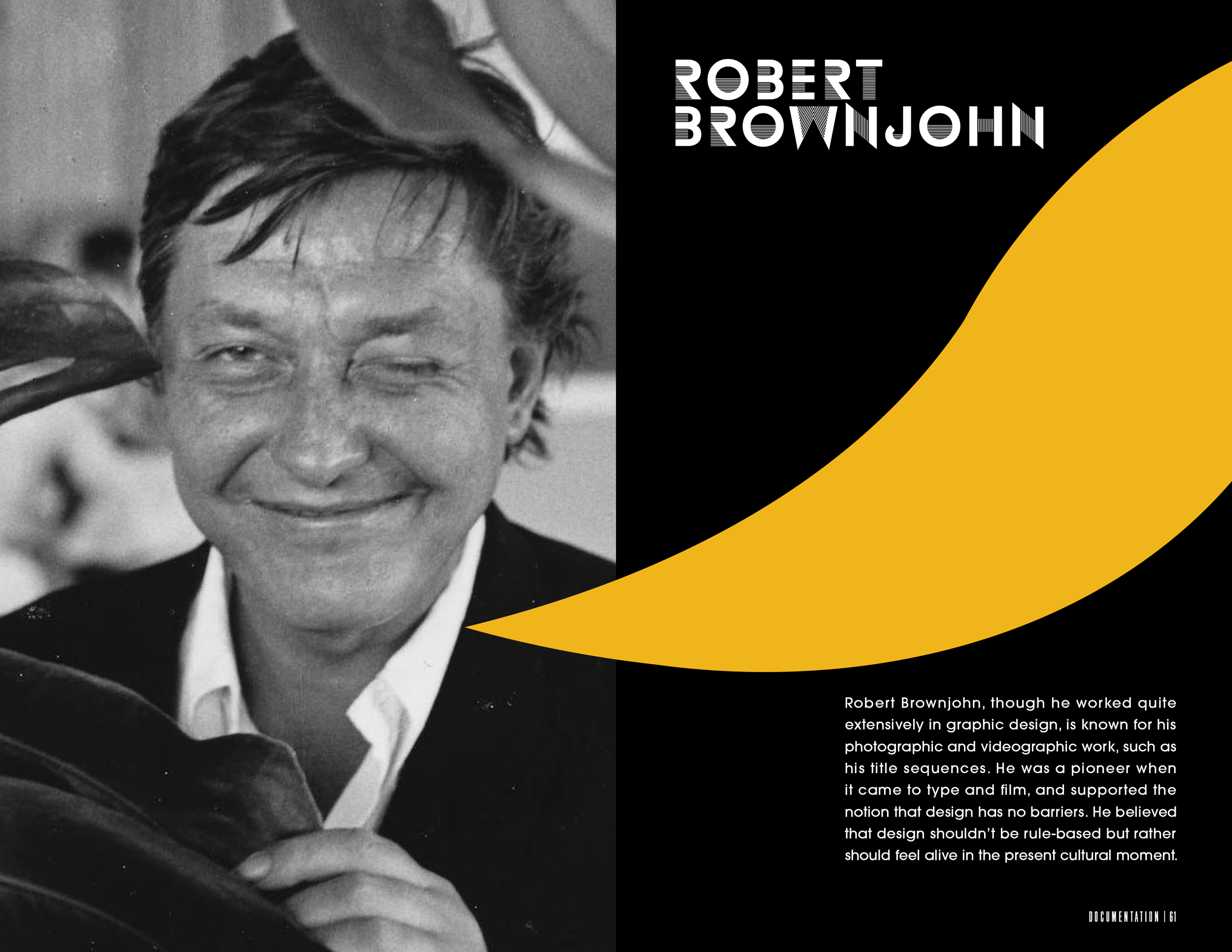
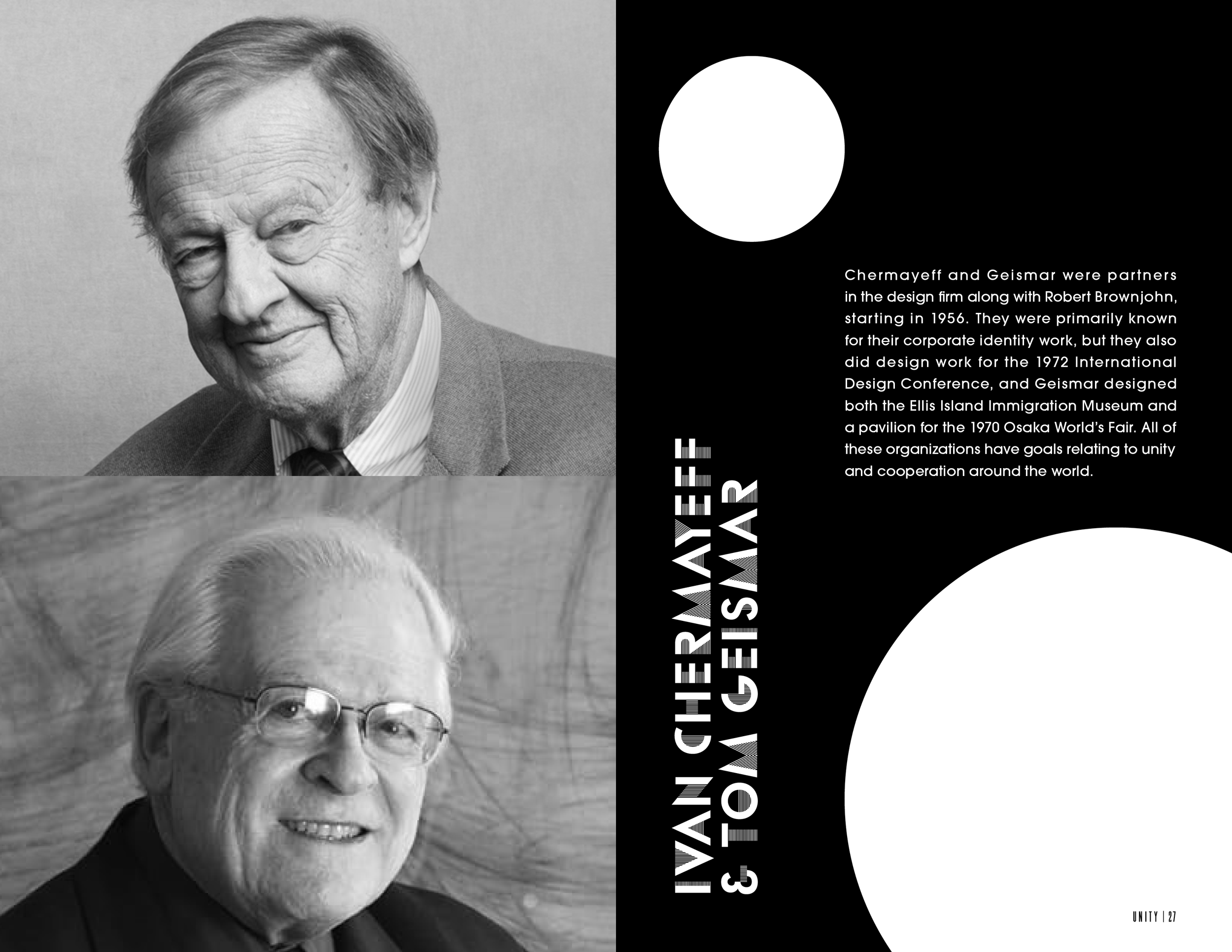
Likewise, Brownjohn, who was best known as a photographer, is included with our documentation, because that was where photography was incorporated in our publication.
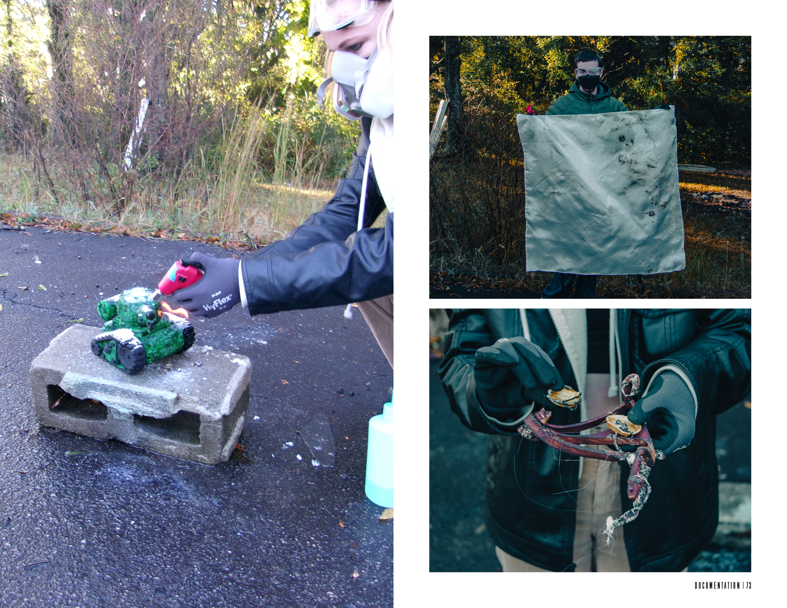
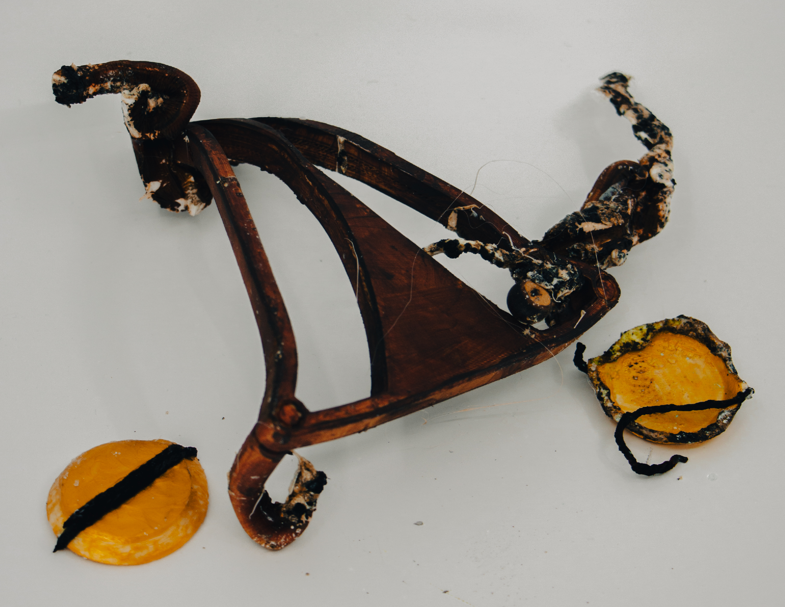
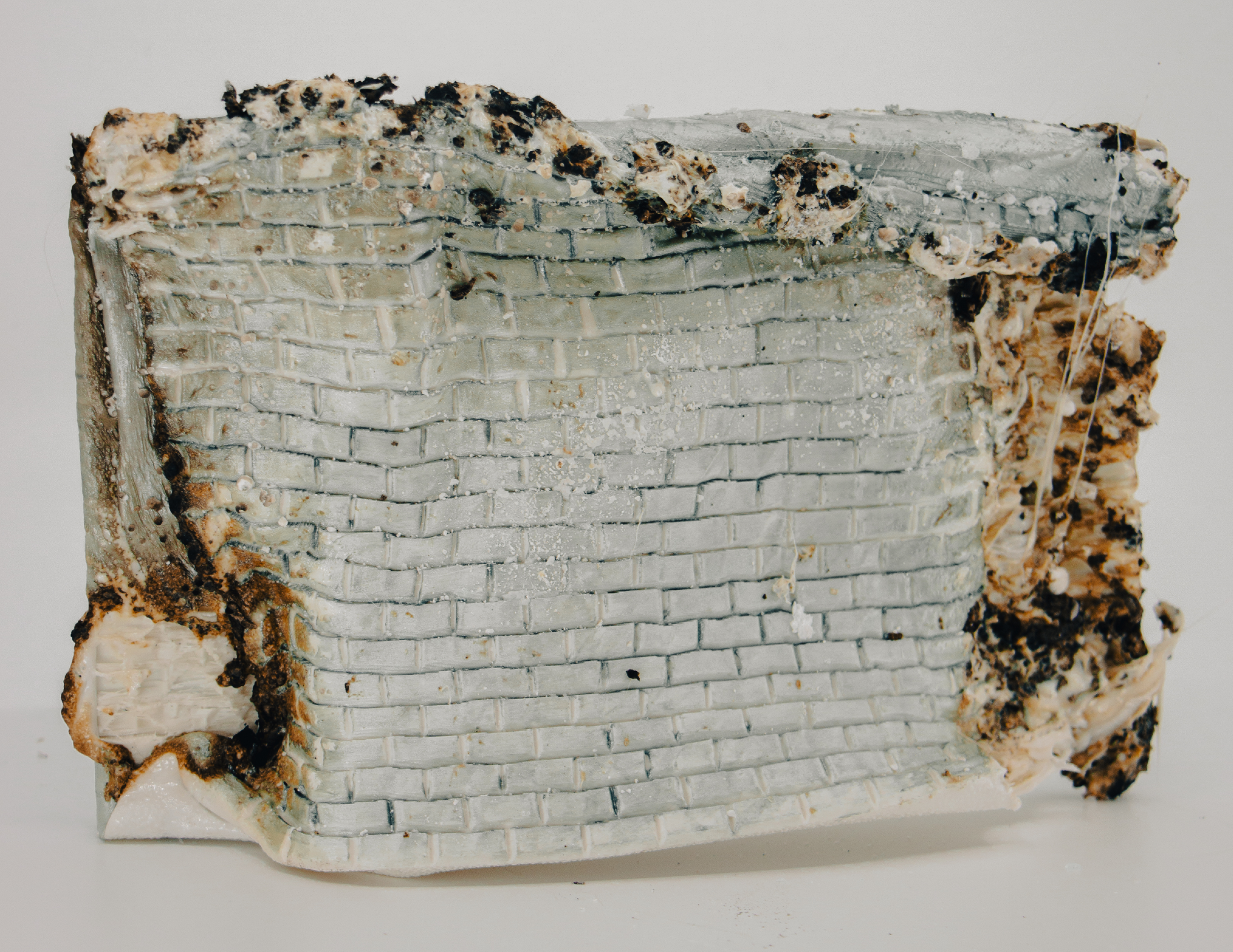
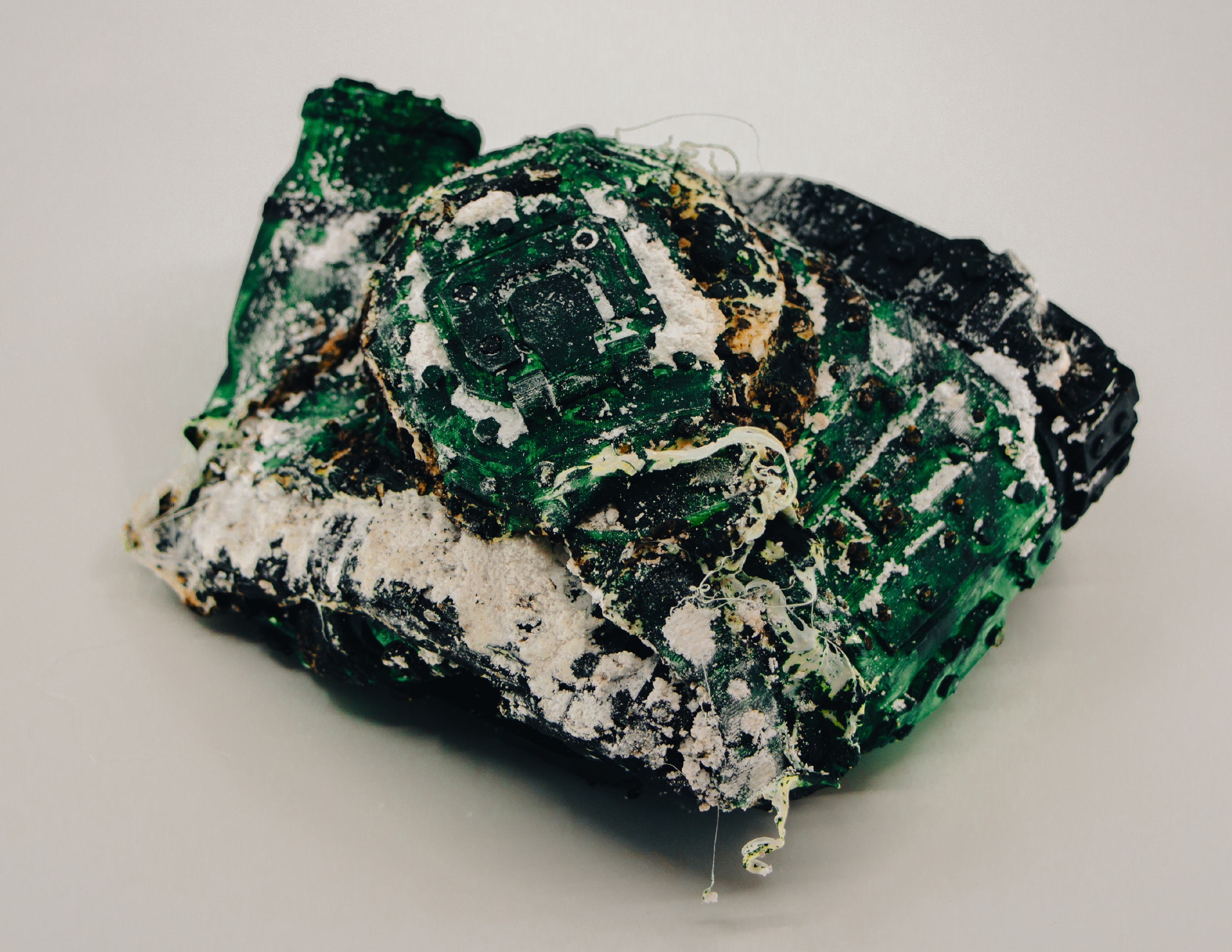
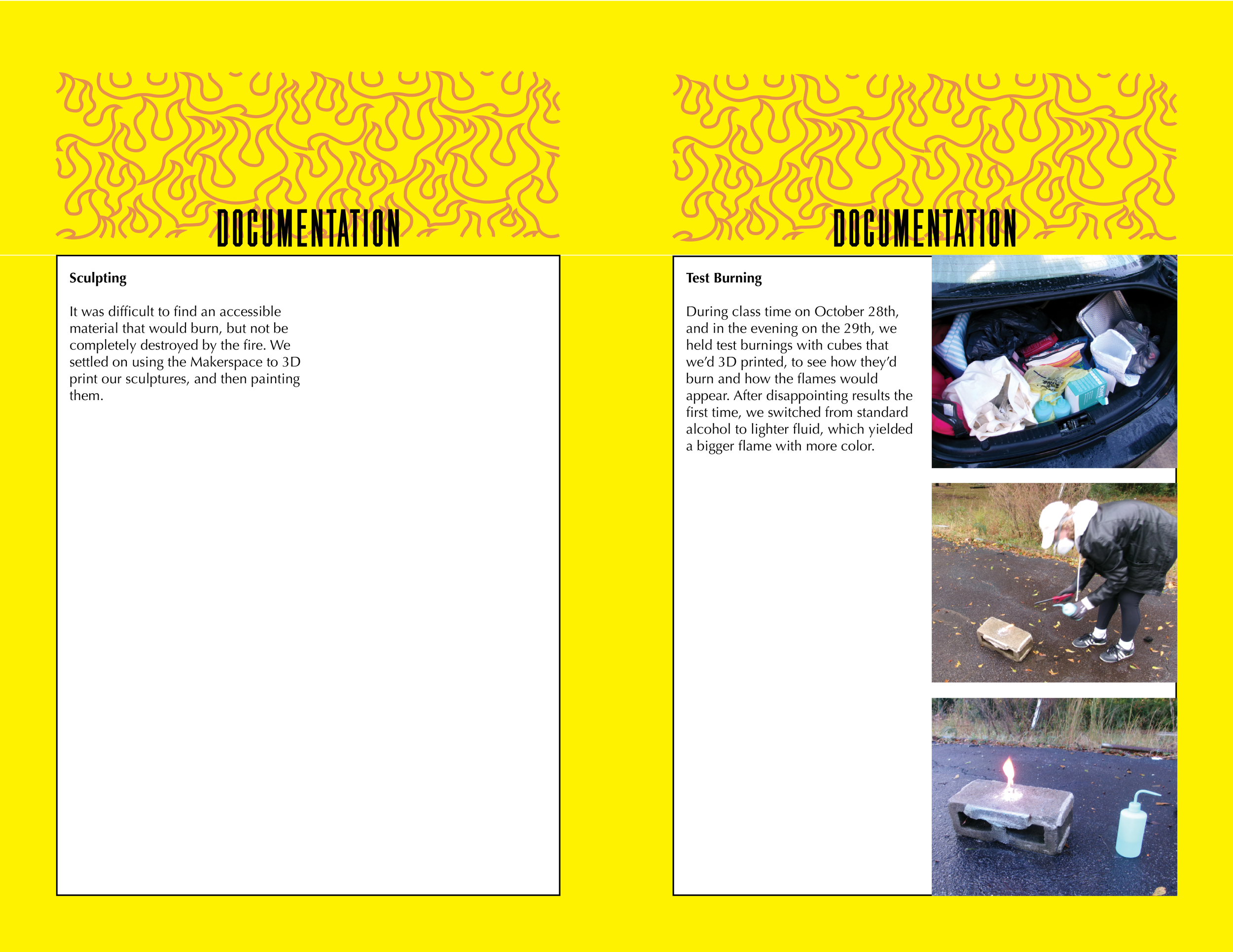
This section includes photos of the sculptures after burning, to convey the impact that a social problem has if it’s left unaddressed.
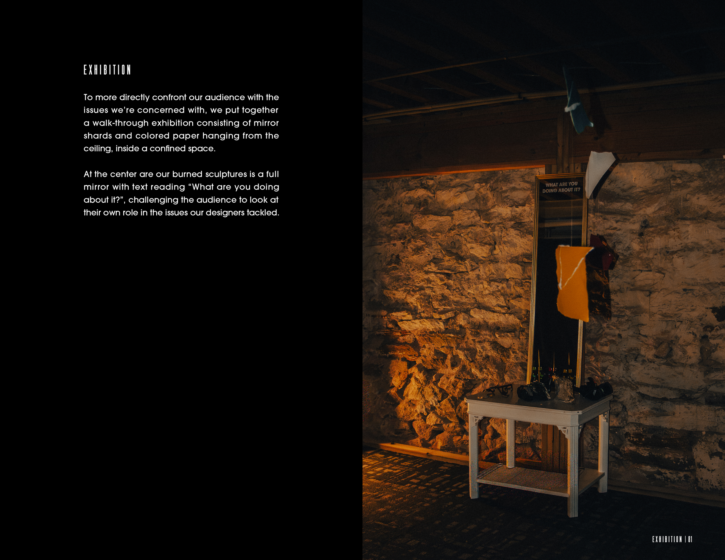
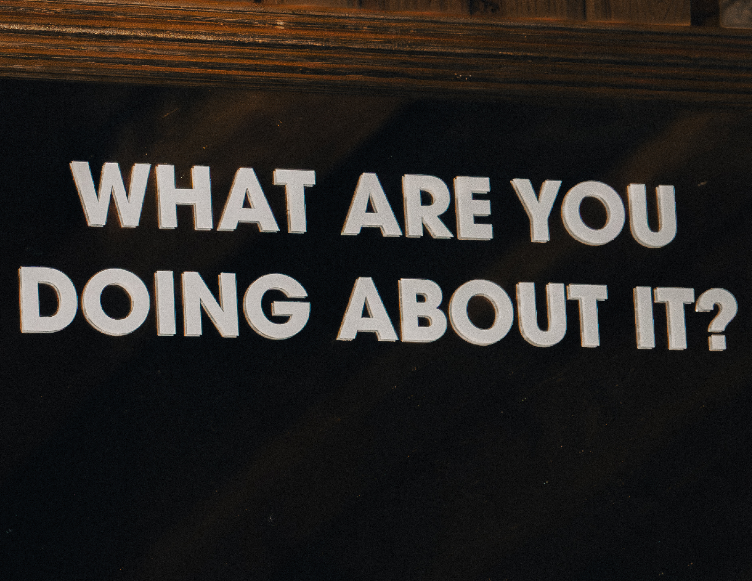
In addition, our team put together a physical exhibition, in order to ground our publication within a specific context; we imagine it would be given out at the entrance to explain the ideas behind the display.
Process
Below are spreads from an early rough draft of the publication. It is formatted similarly, into color-coded sections, but visually it shares little in common with the final product. We ultimately agreed that this visual structure was too restrictive and had an academic feeling that didn’t match the bold nature of the project. Allocating only one page per designer was also judged to not be enough space.